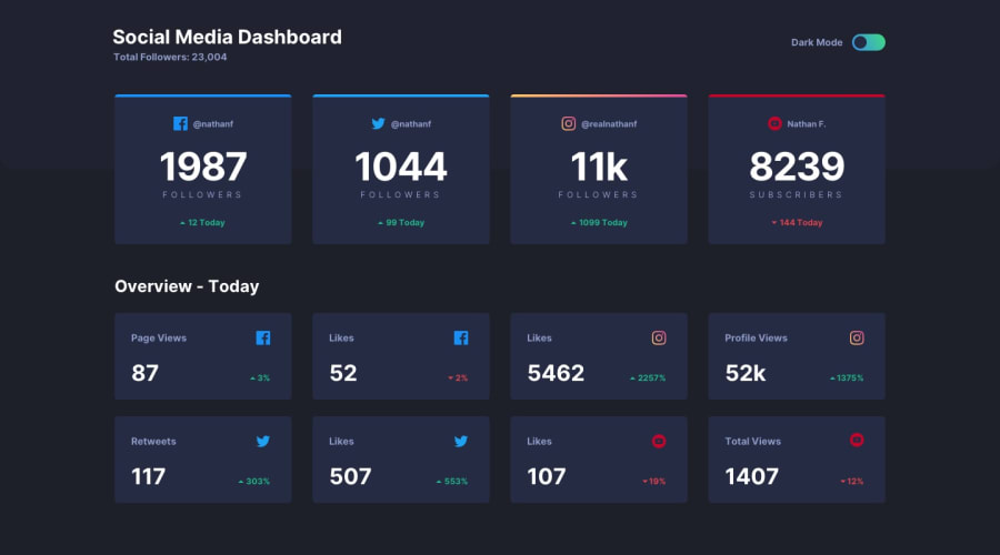
Design comparison
SolutionDesign
Solution retrospective
Any suggestions would be greatly appreciated.
Community feedback
- @Da-vi-dePosted about 3 years ago
Hi, it's a very nice result for this challenge that looks super easy to implement but i rember it has tricky parts! Well done.
- The only thing i noticed, you skipped the tablet version, maybe because you didin't see the design fot it but that doesn't mean going straight from mobile to desktop, it simply means that there's nothing to add, usually tablet version is more like the desktop one.
Keep coding :-)
Marked as helpful0@ttakeyayaPosted about 3 years ago@Da-vi-de
Thank you for your suggestions. The style jumping around as changing the screen size was so strange to me. I totally understood the point you made. Thanks!
0
Please log in to post a comment
Log in with GitHubJoin our Discord community
Join thousands of Frontend Mentor community members taking the challenges, sharing resources, helping each other, and chatting about all things front-end!
Join our Discord
