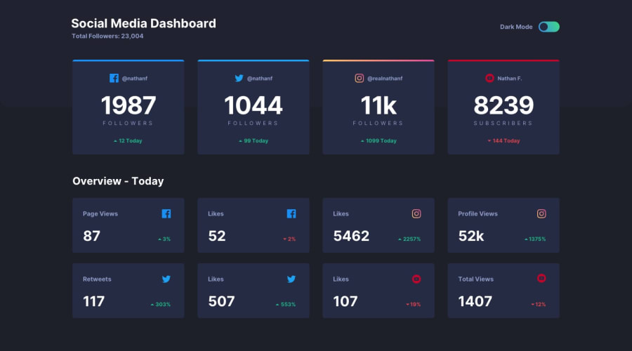
Design comparison
Solution retrospective
I take great pride in my ability to understand and confidently use JavaScript, as well as my successful application of linear-gradient colors to top borders. However, I've learned that planning out my CSS and classes in advance is essential for tackling future challenges.
What challenges did you encounter, and how did you overcome them?Encountered challenges when applying a linear-gradient to the top border of the Instagram stats card. I encountered some issues and had to do some searching. Finally, with the help of resources on CSS tricks, I managed to solve the problem.
What specific areas of your project would you like help with?Would like feedback on whether there was a way to achieve having both my h2 tags turn white on the dark mode version without needing to write a second CSS class for the second h2 to change color:
.dark-theme container-over h2{ color: var(--White-text); }
Community feedback
Please log in to post a comment
Log in with GitHubJoin our Discord community
Join thousands of Frontend Mentor community members taking the challenges, sharing resources, helping each other, and chatting about all things front-end!
Join our Discord
