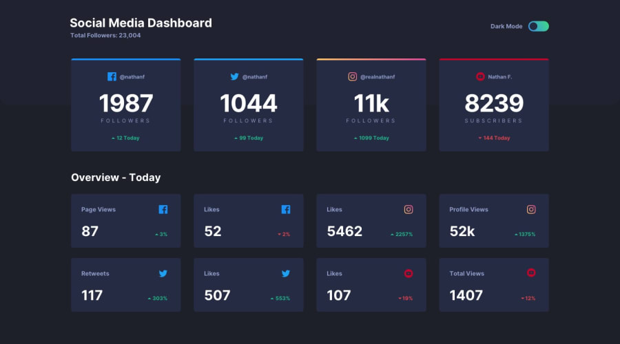
Design comparison
SolutionDesign
Solution retrospective
Pls give your review of my site :)
Community feedback
- @WronskiNPosted over 4 years ago
Well done! I really like your solution, especially how you manage to do the dark/light mode switch. The only thing I am consider is that <h4> just after <h1> tag in html. I think it will be good to use <h2> and so. Anyway I like this project. It will be my next :).
1@mladendjokovicPosted over 4 years ago@WronskiN Thank you, I really appreciate this. It's a confidence boost!
0
Please log in to post a comment
Log in with GitHubJoin our Discord community
Join thousands of Frontend Mentor community members taking the challenges, sharing resources, helping each other, and chatting about all things front-end!
Join our Discord
