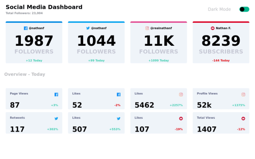
Design comparison
Solution retrospective
How to reduce code size and make it more readable?
Community feedback
- @Cats-n-coffeePosted almost 2 years ago
Hi Eduardo!
Nice job! To answer your question about code size/readability, I think what you have is good! I would suggest moving the "data" from
App.js
to its own file which you can import toApp.js
to use (talking aboutconst dadosCardTop
and bottom). If the images cause you issues, you have a few ways to get around the problem. You can pass the name (facebook, instagram, ...) to a reconstructed path which you can reconstruct in thesrc
attr (if you useimg
), you could try passing the full path to image as an object property, or you could make all the icons in a separate component and pass a prop (I had done this here over a year ago).Nice job breaking up the components code with Js and Css on their own, this makes things clean and reusable.
I believe your theme switcher can be simpler. There are different ways to deal with these, my go-to choice is to get CSS variables on the
body
to match a data attribute. That way you can set all the variables in CSS, you'll reuse the same variable name for both themes but change the values. In your code you can use the CSS variables and once the data attribute changes (using Js) the colors toggle all at once. (example in the same project)Great job! Hope this helps!
Marked as helpful0@MendesEduardoPosted almost 2 years ago@Cats-n-coffee Thank you very much this feedback helped me a lot
0
Please log in to post a comment
Log in with GitHubJoin our Discord community
Join thousands of Frontend Mentor community members taking the challenges, sharing resources, helping each other, and chatting about all things front-end!
Join our Discord