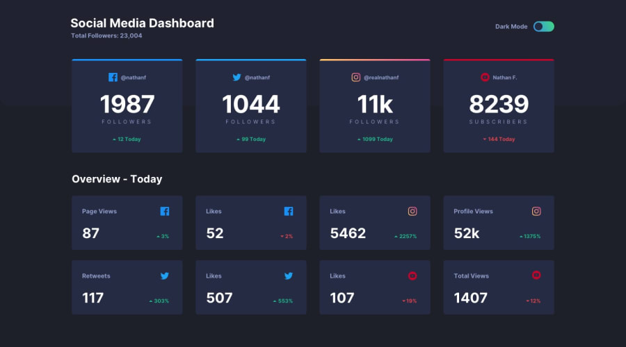
Design comparison
Solution retrospective
I learned a bit here for future problems:
- I added a class .darkMode to the entire body to activate the Dark Mode.
- More styling practice
- More practice adding and removing classes in Javascript
For Dark Mode styling, I learned (but did not apply for this project) about custom CSS themes and giving projects the same name. However, I didn't know how to appropriately switch themes apart from applying the .darkMode class so .darkMode has all the individual stylings for each changed Element.
Problems:
- I was advised to change the checkbox input to a radio input, but upon doing so, the slider on the radio button did not slide back to the original location unlike my previous rendition.
- I'm still wrapping my head around making use of this idea for future projects:
.dark { --bg: #000; }
.light { --bg: #fff; }
body { background-color: var(--bg); }
Community feedback
- @bongendePosted over 1 year ago
Hi! about the dark/light mode toggle, i can suggest you to use different classes in the body, so the theme willl be changed there, and you can use the "prefers-colors-scheme" query to syncronise to the system, and css variables can help you to switch in between. I did this challenge with scss, you can take a look maybe to the javascript app/js/scripts.js in my project to se the logic i used
0
Please log in to post a comment
Log in with GitHubJoin our Discord community
Join thousands of Frontend Mentor community members taking the challenges, sharing resources, helping each other, and chatting about all things front-end!
Join our Discord
