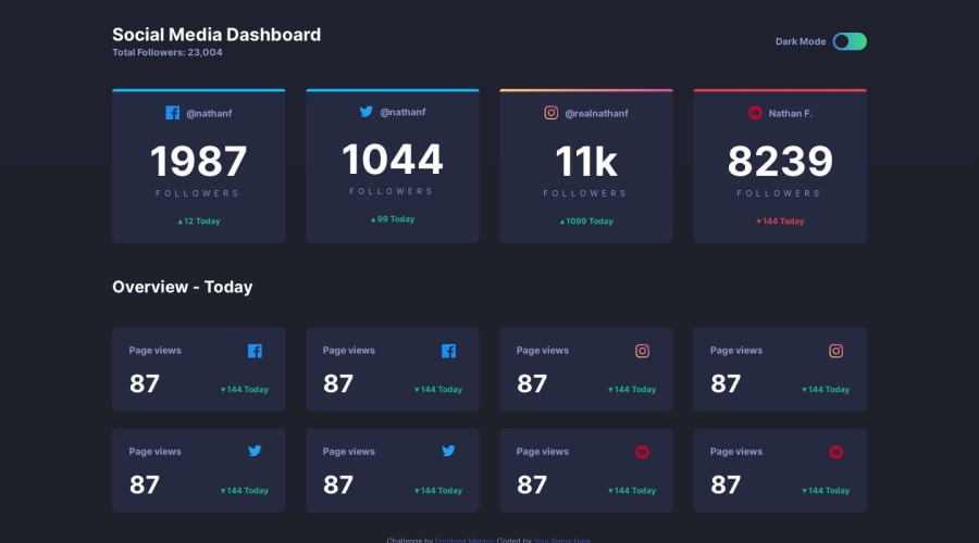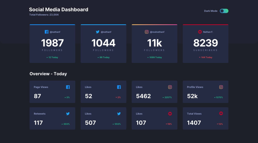
Design comparison
Community feedback
- @kethmarsPosted over 4 years ago
You can check how I solved it from here: https://youtu.be/zfXb3CNBHMQ
1 - @mattstuddertPosted over 4 years ago
Also, have you ever tried using
min-widthmedia queries instead ofmax-width? It's quite a common workflow with front-end developers to use them and work mobile-first. It can often lead to less CSS code and has the benefit of loading in fewer styles for mobile users, which can be a nice performance gain.0@kethmarsPosted over 4 years ago@mattstuddert Good idea! Will keep that in mind to try it out.
0 - @mattstuddertPosted over 4 years ago
Awesome work on this challenge, Kethmar! 🙌
Great to see you posting the video of you working through it as well. At the moment, the toggle isn't working. In the JS you've got
const toggleButton = document.getElementById('toggle');but there doesn't seem to be an element with an ID of "toggle" in your HTML.Your layout looks really good though and attention to detail with the design comparison is great. One small addition could be changing up the responsiveness slightly so that it goes from a single column on mobile to a 2-by-2 grid on tablet and then rows of 4. As opposed to going from single all the way to a row of 4 in one jump.
Keep up the great work! I'm loving the videos and they'll help a lot of people I'm sure! 🙂
0@kethmarsPosted over 4 years ago@mattstuddert Thank you for your kind words and feedback! I fixed the toggle and will update the tablet version according to your feedback!
0
Please log in to post a comment
Log in with GitHubJoin our Discord community
Join thousands of Frontend Mentor community members taking the challenges, sharing resources, helping each other, and chatting about all things front-end!
Join our Discord
