Design comparison
Solution retrospective
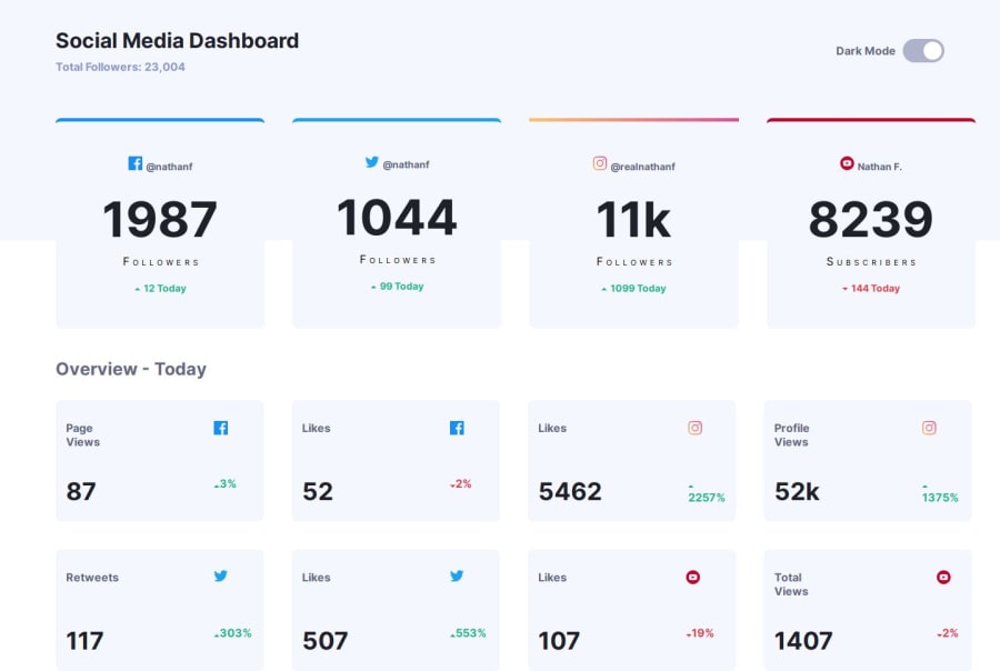
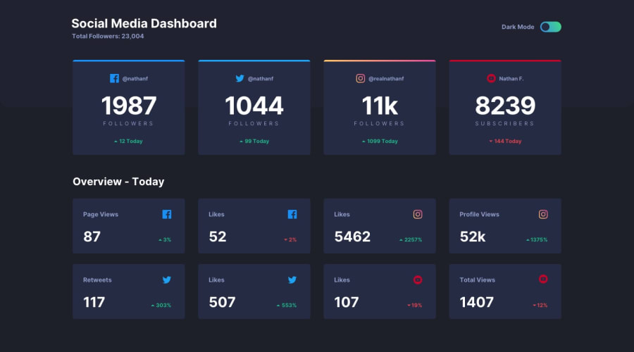
I'd like some help with the theme switcher for the data in the Dashboard the first data stays as the light version and I don't know how to fix that.
Community feedback
- @jakegodsallPosted 8 months ago
Hi 👋
I've taken a look at your source code and narrowed it down.
The reason this weird behaviour is happening with the first element not changing colour in dark mode is to do with how you are using CSS selectors in your SASS.
Right now you have the following selector for selecting each of the cards individually in dark mode:
.fb-resume-data + .dark-cards-resume,
.twitter-resume-data + .dark-cards-resume,
.ig-resume-data + .dark-cards-resume {
  background-color: var(--Dark-Desaturated-Blue-card-bg);
}
However, the
+operator does not select an element which has both the class preceeding the+operator and that following the operator. Rather, this is the adjacent sibling selector. A more general example is:a + bselects elementbif and only if it is the immediate sibling that directly follows elementa. It won't select any otherbelements that are not directly preceded bya. In your case, this means all elements except the first are selected, because the first is not preceeded by any sibling.Hope this makes sense, these selectors can be quite confusing.
To select an element that has both classes, you just need to concatenate the classes in the selector:
.fb-resume-data.dark-cards-resume,
.twitter-resume-data.dark-cards-resume,
.ig-resume-data.dark-cards-resume {
  background-color: var(--Dark-Desaturated-Blue-card-bg);
}
Otherwise great work! Happy coding 😁
Marked as helpful1
Please log in to post a comment
Log in with GitHubJoin our Discord community
Join thousands of Frontend Mentor community members taking the challenges, sharing resources, helping each other, and chatting about all things front-end!
Join our Discord
