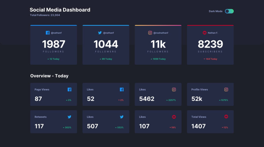
Design comparison
SolutionDesign
Community feedback
- @Kamasah-DicksonPosted over 2 years ago
Your solution looks great on my small mobile also I wasn't expecting a transition on your solution but you did😂 I thought I could criticize you with that. But one thing I will say is there is a transition delay on the cards you can target the HTML root.
You can check my solution below also to show your opinion on mine..👍
( https://kamasah-dickson.github.io/Social-Media-Dashboard/ )
Besides your solution looks great👍 Good job there👍 Happy Coding👍💻
0
Please log in to post a comment
Log in with GitHubJoin our Discord community
Join thousands of Frontend Mentor community members taking the challenges, sharing resources, helping each other, and chatting about all things front-end!
Join our Discord
