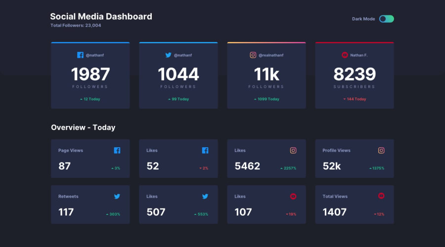
Design comparison
Solution retrospective
I implemented the dark mode through storing the CSS colour values as strings within my javascript file.
Is there a better practise?
Community feedback
- @Yemisrach15Posted about 2 years ago
Hi Graham, good job but this needs a bit of work on responsiveness for tablet sized viewport. A few suggestions,
sectionelement needs a heading.- The cards inside
sectionimo should bearticlefor better semantics.articles are used for self-contained information and it is appropriate to use them in this case. inputneeds label for accessibility purpose as your report says.
For your question, I prefer using dataset attributes on a container (eg. body). Inside the javascript code, I change this dataset's value based on user's preference and inside the CSS I do something like
:root {
    <your css color variables for light mode>
}
[data-theme="dark"] {
    <your css color variables for dark mode>
}
This is assuming a container such as
bodyhas adata-themeattribute. It's only my preference since it needs less js code :)Marked as helpful1@GrahamTheobaldPosted about 2 years ago@Yemisrach15 Thank you very much for your feedback, it is noted and appreciated (:
0
Please log in to post a comment
Log in with GitHubJoin our Discord community
Join thousands of Frontend Mentor community members taking the challenges, sharing resources, helping each other, and chatting about all things front-end!
Join our Discord
