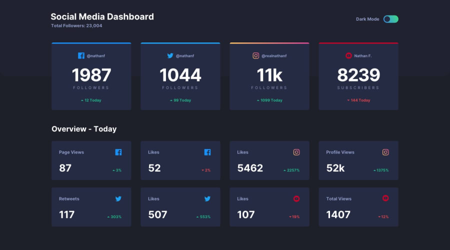
Dashboard with automatic day/night color scheme switching
Design comparison
Solution retrospective
For this challenge I tried to make my javascript more reusable and spent time covering all the edge cases. I've used the @media prefers-color-scheme queries along with CSS so that I have three theme classes, theme--light, theme--dark, and theme--default. theme--default uses the @media queries to automatically follow the system preferred scheme, while light/dark themes are used to pin user preference via javascript when needed.
I've tried to make this one accessible, but it was awkward. One problem I had was attaching the arrow svg's via ::before pseudo classes. The screen reader insists on announcing the image, no matter what. In the end I used a .visually-hidden span and aria-none in a couple of places to clean up the screen reader experience.
Community feedback
- @grace-snowPosted almost 2 years ago
Really nice solution! I’m not sure what you mean about the screenreader announcing images when you used a pseudo… can you explain a bit more what you were trying, why and what was announced/what you wanted to be announced?
0@jefcooperPosted almost 2 years ago@grace-snow I'm using a ::before pseudo element to attach the up/down arrow in front of the count element which is just a 'p'. e.g.
<p class="followers__today followers--negative" aria-hidden="true">144 Today</p>I was hoping SR would read '144 Today', but instead, I get it announcing an image and then the text. Perhaps I'm using the screen reader wrong, still stumbling my way through voiceover. Since the image is attached in CSS, there is no HTML modification to remove it or ignore it. I cannot attach an aria-hidden to the pseudo-element. I think maybe ::before is actually seen as content and ::after is ignored mostly by voiceover.
I also realized that I need some visually-hidden text there to indicate if the number is up or down since the only indication is that svg icon... so it worked out ok.
0@partumPosted almost 2 years ago@jefcooper I think you still want the screen reader to announce the image, since the image provides important information. I set the alt text on the up arrow to "up by" so that the screen reader will read "up by 144 today." That's just my idea. I'm not a pro. :)
1@grace-snowPosted almost 2 years ago@jefcooper yes as Julia says you need to make sure it communicates whether it is an increase or decrease
Screenreaders will always Read out the value of a pseudos content property
0 - @grace-snowPosted almost 2 years ago
That sounds a bit more complicated than it needs to be, having three themes… you usually wouldn’t need a third one for the user preference
this is a good article about theme switching I really like this article except the aria label is not actually communicating which state is active. I'd rather something more explicit like "activate dark theme" along with aria-pressed
0@jefcooperPosted almost 2 years ago@grace-snow I mostly followed this approach. The third theme class, is just @media including the light/dark themes, so that the theme--default is an auto-switching theme. If javascript is disabled, the page will still switch light/dark based on system changes. So when I remove an explicit light or dark override, I am restoring automatic.
0
Please log in to post a comment
Log in with GitHubJoin our Discord community
Join thousands of Frontend Mentor community members taking the challenges, sharing resources, helping each other, and chatting about all things front-end!
Join our Discord
