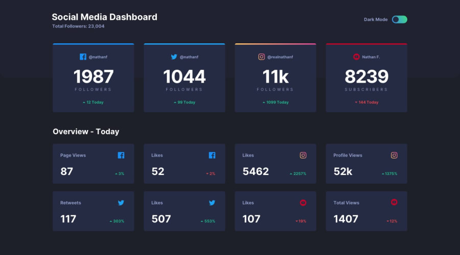
social media dashboard with theme switcher
Design comparison
Solution retrospective
Hello everyone i have tried my best to align everything as per design. i know it could be done better and i am always open for suggestions. is there anything that can be improved ?
Community feedback
- @0xOctopusPosted almost 2 years ago
Great work! To enhance the responsiveness of your design, I suggest implementing CSS GRID. This will allow you to easily control the number of rows and achieve a symmetrical layout for your dashboard. Instead of having one row with three cards and another with just one, you can use GRID to ensure all rows have the same number of cards. You can refer to my website for inspiration, and feel free to check out the code to see how I've implemented it.
My code: https://github.com/0xOctopus/front-6
Website: https://0xoctopus.github.io/front-6/
0
Please log in to post a comment
Log in with GitHubJoin our Discord community
Join thousands of Frontend Mentor community members taking the challenges, sharing resources, helping each other, and chatting about all things front-end!
Join our Discord
