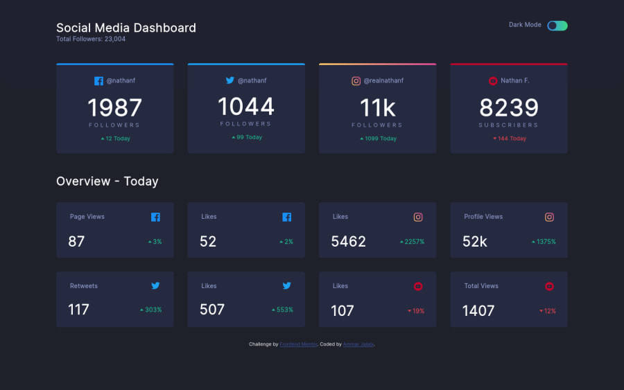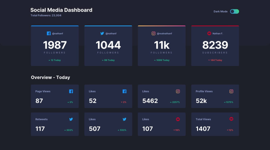
Design comparison
Solution retrospective
Check out my solution to this challenge, and let me know your thoughts. I can take criticism, so don't shy away from writing your honest opinion. Thank you for your time!
Community feedback
- @ApplePieGiraffePosted about 3 years ago
Hello there, Ammar Jalabi! 👋
Nice work on this challenge! 🙌 Your solution looks great and responds nicely! 👍
A couple of suggestions I have are,
- Wrapping each of the social media stats cards in a link tag (since it seems like they would take the user somewhere that displays more information when they are clicked). Right now, those elements are just plain
divs (which works, but isn't great for accessibility or semantics). - Adding a visible focused state to the theme toggle (so that keyboard users can tell when that element is highlighted). Not adding focused states to interactive elements can make your page difficult to navigate for keyboard users. 😉
Hope you find this helpful. 😊
Keep coding (and happy coding, too)! 😁
Marked as helpful1@AmmarCodePosted about 3 years ago@ApplePieGiraffe Thank you so much for your great tips👍 I will update my code soon and would keep the keyboard users in mind from now on. 😉 Happy coding! 😁
1 - Wrapping each of the social media stats cards in a link tag (since it seems like they would take the user somewhere that displays more information when they are clicked). Right now, those elements are just plain
Please log in to post a comment
Log in with GitHubJoin our Discord community
Join thousands of Frontend Mentor community members taking the challenges, sharing resources, helping each other, and chatting about all things front-end!
Join our Discord
