Submitted almost 4 years ago
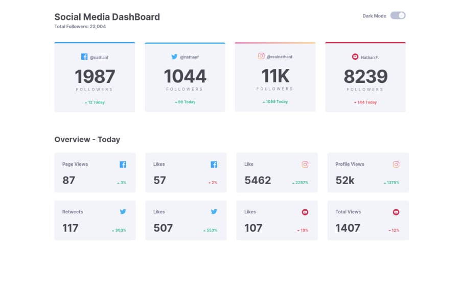
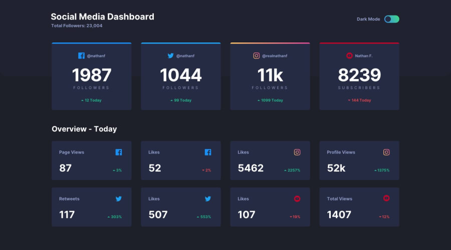
Social media dashboard with theme switch in React.js , StyledComponet
@BoyanLiuu
Design comparison
SolutionDesign
Solution retrospective
Any feedback or suggestions will be appreciated ;)
Community feedback
- @SzymonRojekPosted almost 4 years ago
**Hi Boyan, **
Well done :D
Just a few suggestions from me:
- try to work on RWD because there is a "huge jump" between mobile size and desktop - rapidly changing to 4 cards in a row after 1100px (probably play with the width also) => inspect your project on different devices, especially ipads, tablets, laptops;
- the line after "total followers" could have more opacity so it will be more "smooth", at the moment it looks like a LINE that strongly divides the space between headings and sections below;
- add a transition to the cards (have a check when you will switch the mode - at the moment you have got a big contrast).
That's it from me. Ps. don't forget to upvote any comments on here that you find helpful.
Many greetings :D
2@BoyanLiuuPosted almost 4 years ago@SzymonRojek
Thanks for your advice. I think you got the valid point for all three suggestions. I will definitely go to fix it tomorrow.
0
Please log in to post a comment
Log in with GitHubJoin our Discord community
Join thousands of Frontend Mentor community members taking the challenges, sharing resources, helping each other, and chatting about all things front-end!
Join our Discord
