Design comparison
SolutionDesign
Solution retrospective
I have a couple questions, things I wasn't sure about.
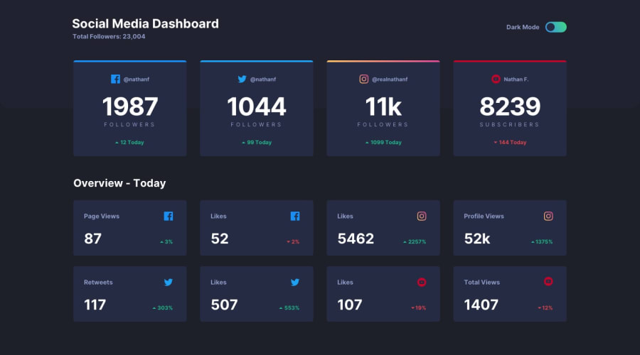
- I've decided to present the icons as background image masks on elements, but that required me to set width/height on the elements themselves. My thought process was to reduce the amount of img tags generated and make style switching based on a data attribute, but I'm wondering if it's not a bad idea for accessibility.
- Since the top cards can have a top border with a gradient I went with an absolutely positioned pseudo-element, is there a different or better solution?
- Something similar for the top background accent - since it overhangs between the two sections I went with an extra absolutely positioned div with a set height and the accent color as a background, but that seems a bit rough.
Community feedback
Please log in to post a comment
Log in with GitHubJoin our Discord community
Join thousands of Frontend Mentor community members taking the challenges, sharing resources, helping each other, and chatting about all things front-end!
Join our Discord
