Submitted almost 5 years ago
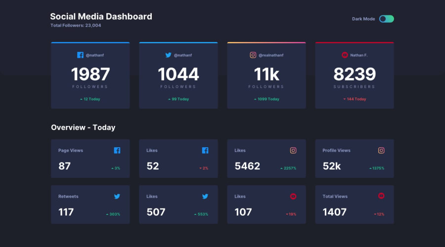
Social media dashboard with dark mode tuggle button
@Kotaro666-dev
Design comparison
SolutionDesign
Community feedback
- @hannah-saurusrexPosted almost 5 years ago
Great work! 🎉 It looks like you could add a bit of margin between the header area, and the dashboard tiles. But this solution looks great across different devices. Awesome job! 🙌🏻
2@Kotaro666-devPosted almost 5 years agoDear @hannah-saurusrex,
Thanks for your feedback! I will take your advice into consideration!
0
Please log in to post a comment
Log in with GitHubJoin our Discord community
Join thousands of Frontend Mentor community members taking the challenges, sharing resources, helping each other, and chatting about all things front-end!
Join our Discord
