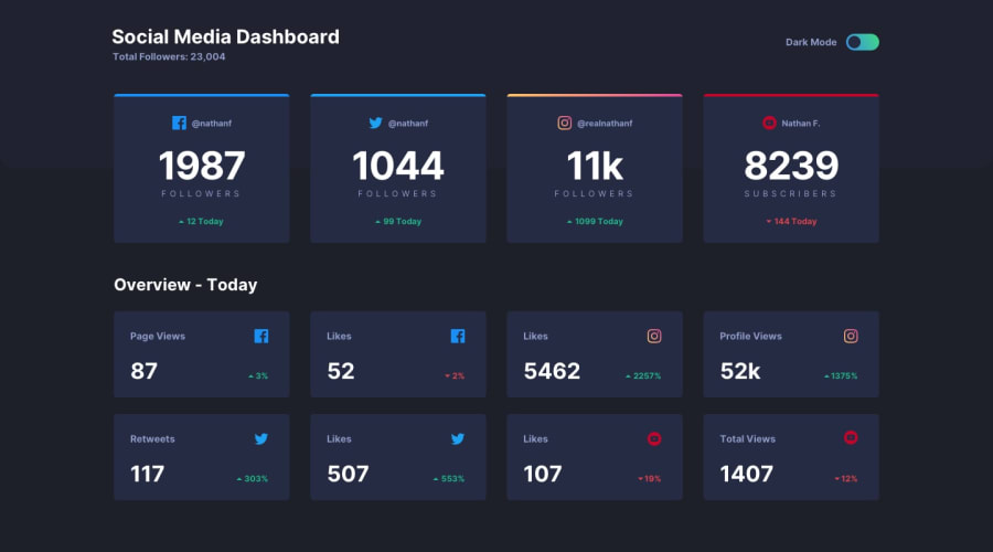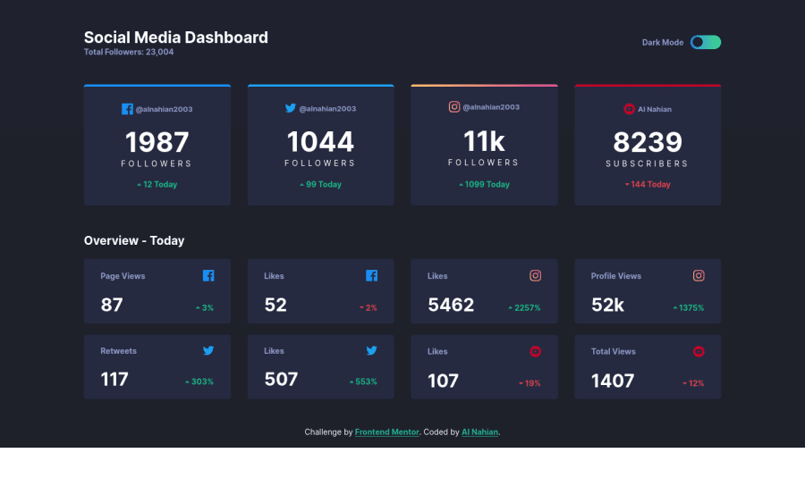
Social Media Dashboard With Dark & Light Theme Challenge Completed!
Design comparison
Solution retrospective
Hi There I hope you're doing great! Today I've completed this challenge with love and passion. I've learned many new things while building the project and I'm so much excited to complete another challenge here.
Please visit the Live Site and give me an honest review of my challenge and feel free to suggest to me some ideas about if I could do something more on this project or let me know if I made any mistakes anywhere. Give me a ❤ if you liked this project.
Thank You
Community feedback
- @adarshcodesPosted almost 4 years ago
Hi @alnahian2003, I'm doing great and I believe you are also fine. You did an amazing job on this challenge(your love and passion involved in this solution are worth putting). Let's talk about your solution more briefly:
- Design aspect: It really looks great and is very similar to the original design. Hove effect on the cards is also great and the mode changer is also working fine.
- Responsiveness: it is well responsive for most of the screens.
- Issues aroused: No HTML and Accessibility issues👍.
Keep it up👏. Happy coding😀
3@alnahian2003Posted almost 4 years agoHello Dear Adarsh Codes I hope you're doing great as you always do. I'm really happy to see that you appreciated me and you explained everything well about my challenge. It's true that I'm feeling much more motivated and inspired after seeing your compliment on my challenge.
Thank You So Much, Dear! You made my day :)
Happy Coding
1 - @SzymonRojekPosted almost 4 years ago
Hi Alnahian,
I like your final solution. Great job!
A few tips for you:
HTML:
- semantic tags matter: at the moment you have got lots of divs in your HTML code. Divs are semantically inert elements — elements that don’t really do or say anything. The term "semantic" refers to the meaning of a word or a thing, so "semantic elements" are elements designed to mark up the structure of a document in a more meaningful way, a way that makes it clear what they're for, what purpose they serve in the document. Check the MDN documentation. Therefore, it will be amazing to use semantics tags like main, section, article, header etc - depending on the project, of course.
- accessibility: there is no any important attributes for icons, toggle like aria, role etc. This is a huge topic but very valuable. I can recommend this article from the Smashing Magazine - Building inclusive toggle buttons. Check it out.
Design:
- you can add transition when you are changing the color of the card and also when switching the mode. At the moment colors are changing rapidly. The key is a smooth transition, which is always nice but it doesn't have to be very long.
- there is another problem with the transform translate or scale: your text, icons are moving, just check it out. I've had a quite big problem with the flickering text (was moving, jumping a bit, blurry). Honestly, I've spent a few hours on debugging code. I did lots of research, read a few articles, fixing the code many times - of course, there are pluses of it. For example, it is better to write more simple code and do not give unnecessary additional effects. Finally, I have received good advice from @grace-snow - it was very valuable.
That's it from me. Ps. don't forget to upvote any comments on here that you find helpful.
Greetings :D
3@alnahian2003Posted almost 4 years agoHello There, Szymon Rojek!
Thank you so much for appreciating my final solution on this challenge. I'm very glad and happy to see that.
I actually read all the things you've commented on here and after reading all of this, I was thinking like, I should start learning HTML, CSS from scratch again. So that I could learn more about some deep and important concepts on writing HTML in a different way like Using The Semantic Elements (that you've mentioned). Though it's not like the concept of Semantic Element is quite new to me, but I've worked before and made a few projects using the Semantic Elements.
You also suggested some excellent and helpful tips about improving the Accessibility, Design. I really want to appreciate your kind and heartiest suggestions and I will definitely keep them on my mind. I will definitely implement the ideas of writing HTML using Semantic Elements in my next challenges.
Thank You again for your honest review and valuable suggestions.
Happy Coding
1@SzymonRojekPosted almost 4 years ago@alnahian2003
Hi again. Thank you so much for your kind words. I have checked your website - it is amazing, what is the code environment? Great design, really nice colors, it looks very personally and says about you a lot. Congrats :D
1@alnahian2003Posted almost 4 years agoHi There, Szymon Rojek!
I'm sorry, what kind of Code Environment you're talking about? have you asked me about my code editor? it's VS Code.
Thanks again, mate!
If there's an option available like "Following" someone, then I would definitely follow you. However, Happy Coding <3 I'm so much grateful to you.
0@SzymonRojekPosted almost 4 years ago@alnahian2003
Hi, I have seen your website https://alnahian2003.github.io/me/#home. Didn't have time to check it thoroughly. Did you code it? About following - I am learning "how to code" like you so in my opinion I don't think so that I deserve for it hehe but thank you for your kind words again. I really appreciated it.
1@alnahian2003Posted almost 4 years agoHey there, Szymon! How are you doing? I hope you're fine and doing great. Thanks for visiting my portfolio website. Yes, I code it.
**Thanks Again for your heartiest words, suggestions, and everything that you've provided me **
Happy Coding
0 - @abhik-bPosted almost 4 years ago
Hi Al Nahian 👋
Your solution is fantastic , it is very responsive 💯and it looks great 🎉
Happy Coding and Keep contributing these Fantastic solutions 🚀
1@alnahian2003Posted almost 4 years agoThank You Abhik! I'm really glad to see you appreciated me. I'm feeling much much motivated to keep working on my next challenges. I'm can see my improvements while I'm trying to complete a challenge here and it seems like my skills are being upgraded and updated day by day.
Best Wishes to you. Happy Coding
1 - @AryaAnish121Posted almost 4 years ago
Hi, Al Nahian,
It's already perfect only one suggestion:-
- You could make the card a 1rem bigger
Happy Coding
0
Please log in to post a comment
Log in with GitHubJoin our Discord community
Join thousands of Frontend Mentor community members taking the challenges, sharing resources, helping each other, and chatting about all things front-end!
Join our Discord