Social Media Dashboard With CSS Grid And Light/Dark Theme Transition
Design comparison
Solution retrospective
Hey, everybody! 👋
This was an awesome challenge that was a little trickier than I initially thought! 😅
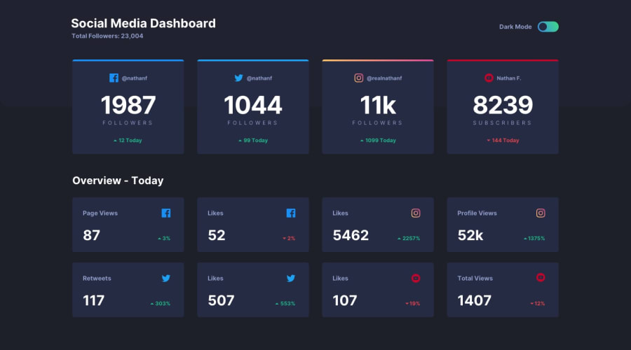
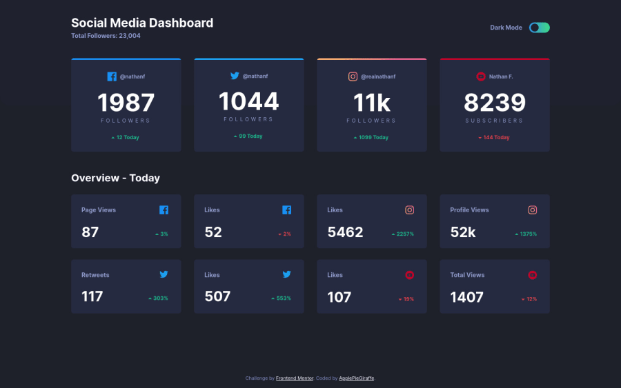
This was my first time creating a site with light/dark themes but I'm pretty happy with the result. I added this cool transition that ripples over the cards when the theme is changed! 😆
As usual, feedback is welcome and appreciated! 😊
And as always, happy coding! 😁
Community feedback
- @Octagon-KingPosted over 3 years ago
That's really cool.. A question how to make the icons fixed to the cards.. in my solution when I try to change the resolution, it changes positions.
1@ApplePieGiraffePosted over 3 years ago@Octagon-King
Thanks! 😀
I used flexbox to lay out the elements in the first row of cards on the page and CSS grid to lay out the elements in the the rest of the cards. I think keeping the icons in place when the size of the screen changes is a matter of making sure the icons are correctly placed within their container (which you can do with properties like
justify-content
oralign-items
for flexbox andalign-self
andjustify-self
) and that the size of the card itself is large enough for the items inside it (so that they don't get squished or start being pushed around). 😉 Feel free to use the dev tools to inspect the code for this solution and poke around. Doing that often helps me learn a lot from other people's solutions. 😅1@Octagon-KingPosted over 3 years ago@ApplePieGiraffe Thanks! I did it and I was using flexbox for the second small cards too but when I start using grid it made it easier and less code.
Thanks again. 😉 for a Helping a Newbie
1@Octagon-KingPosted over 3 years ago@ApplePieGiraffe Here you can see what i have done: https://distracted-noether-27fb8c.netlify.app
0@ApplePieGiraffePosted over 3 years ago@Octagon-King
No problem! 👍
The layout of the cards in your site is looking pretty good, right now! 😀
0 - @brasspetalsPosted about 4 years ago
Can't believe I missed this! I haven't done this challenge yet, but had to drop in to let you know that theme switch transition is fantastic! 🙌 Definitely bookmarked for when I get around to this one.
1 - @BerylBucketPosted about 4 years ago
This is so good!
P.S. Your profile says you're a newbie, but I don't believe it. :)
1@ApplePieGiraffePosted about 4 years ago@BerylBucket
Haha, thanks! I still have much to learn... but I guess I'm becoming a little more familiar with a few things. 😊
Happy coding!
1 - @artimysPosted about 4 years ago
Very cool. Nice touch on the ripple animation for the items.
Keep it up, waiting for your next solution 👍
1 - P@tedikoPosted about 4 years ago
Hello, ApplePieGiraffe!
Great job as always! I came to see your solution to learn something new. The only thing that caught my eye in this great project was the lack of toggle button animation. What I could suggest is:
- Maybe instead of adding
.toggle-switch__btn--inactive
class to your#toggle-switch
button and changejustify-content
toflex-end
you should add this inactive class to your.toggle-switch__circle
and settransform: translate()
on it. Combining this with transition on your circle element you'll get nice and smooth animation. I hope that what I wrote makes sense.
Good luck, have fun coding :)!
1@ApplePieGiraffePosted about 4 years ago@tediko
I was actually thinking of doing something like that but I just got lazy and went with using flexbox to quickly change the position of the circle element. 😆 But as you suggested, I think the tiny bit of extra effort would be worth it, though! 😁
Thanks for the feedback! 😊
0 - Maybe instead of adding
- @doums85Posted about 4 years ago
Waouh Just amazing PERFECT 👏👏👏
1
Please log in to post a comment
Log in with GitHubJoin our Discord community
Join thousands of Frontend Mentor community members taking the challenges, sharing resources, helping each other, and chatting about all things front-end!
Join our Discord