Design comparison
Solution retrospective
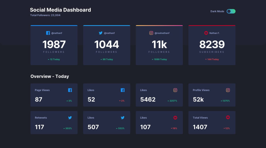
The project is supposed to have two background colors (one that takes up about 20% of the top and the second color is the rest). The first four cards are supposed to sit half on one color and half on the other. Any tips are or info on how to accomplish that would be great.
Community feedback
- @coderdanniePosted over 1 year ago
Hi. Congrats on the completion of this project. An extra features you can add is to store the themes state using browser localstorage so that your site can maintain the theme state even if the page was reload. Right now if I switch to light mode and reload the web page its switching back to the default theme. Using browser storage to store the theme and accessing the themes based on user preference will prevent this from happening. https://developer.mozilla.org/en-US/docs/Web/API/Window/localStorage
0
Please log in to post a comment
Log in with GitHubJoin our Discord community
Join thousands of Frontend Mentor community members taking the challenges, sharing resources, helping each other, and chatting about all things front-end!
Join our Discord
