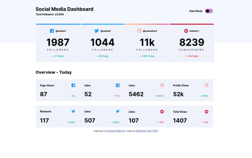
Submitted almost 5 years agoA solution to the Social media dashboard with theme switcher challenge
Social Media Dashboard
@CodingDatum

Solution retrospective
This was so much fun, and it presented a few learning opportunities. Made it from scratch, I'm sure I could be much more organized with my code but I was just happy to get it working. I welcome feedback! Thanks!
UPDATE: For some reason when I open the entire page, it looks similar to the solution, but when I look at the design comparison, it is way off. What is going on here?
Code
Loading...
Please log in to post a comment
Log in with GitHubCommunity feedback
No feedback yet. Be the first to give feedback on Matthew's solution.
Join our Discord community
Join thousands of Frontend Mentor community members taking the challenges, sharing resources, helping each other, and chatting about all things front-end!
Join our Discord