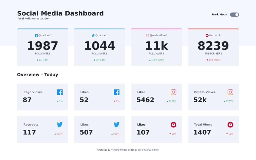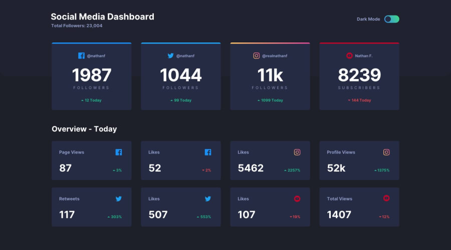
social media dashboard using TailwindCSS and vanilla JavaScript
Design comparison
Solution retrospective
I am not able to make Instagram card border with gradient color. If anyone knows how to do it please let me know.
Community feedback
- @zuolizhuPosted over 4 years ago
Hey Sagar,
Good work on this solution!
border-colordoes not allow you to use gradient color, instead, you can useborder-image😎. e.g.border-image: linear-gradient(45deg, hsl(37, 97%, 70%) ,hsl(329, 70%, 58%)) 1;Check out this documentation for more details: https://developer.mozilla.org/en-US/docs/Web/CSS/border-image
Me personally prefer use
::beforeor::afterfor those small design elements (arrows, borders, icons etc, you don't have to think about theborderas a border 🤯).A gradient border would be something like this:
.card::before {
  width: 100%;
  height: 4px;
  background: linear-gradient(45deg, hsl(37, 97%, 70%) ,hsl(329, 70%, 58%));
}
Hope this helped.
Happy coding 😆
2@sagarkauravPosted over 4 years ago@zuolizhu Thanks for showing me new CSS tricks but could not able to make it work with your example. I used an example from https://css-tricks.com/gradient-borders-in-css/. I am using a wrapper div with background color and giving top padding to make it look like border.
0 - @RedVelocityPosted over 4 years ago
Great job!
Just a small thing that I've noticed in your css, always add custom classes before @tailwind utilities directive. This currently has no effect on your code but it's a good practice in case you decide to '@apply' tailwind utilities in your custom classes.
More information can be found here: https://tailwindcss.com/docs/extracting-components
1@sagarkauravPosted over 4 years ago@RedVelocity Thanks for the feedback I have moved all the custom CSS before Tailwind imports
0 - @grace-snowPosted almost 4 years ago
Hi Sagar,
This looks really nice. It would be amazing if you made it more accessible though - especially that dark mode toggle. It's inaccessible to assistive technology at the moment because no native form elements have been used. There are lots of accessible patterns for toggles out there if you look them up. I'd recommend using a checkbox in this case where there is only one label (so checked = dark mode)
Good luck
0@sagarkauravPosted almost 4 years ago@grace-snow I have changed dark mode toggle with label and checkbox implementation.
0
Please log in to post a comment
Log in with GitHubJoin our Discord community
Join thousands of Frontend Mentor community members taking the challenges, sharing resources, helping each other, and chatting about all things front-end!
Join our Discord
