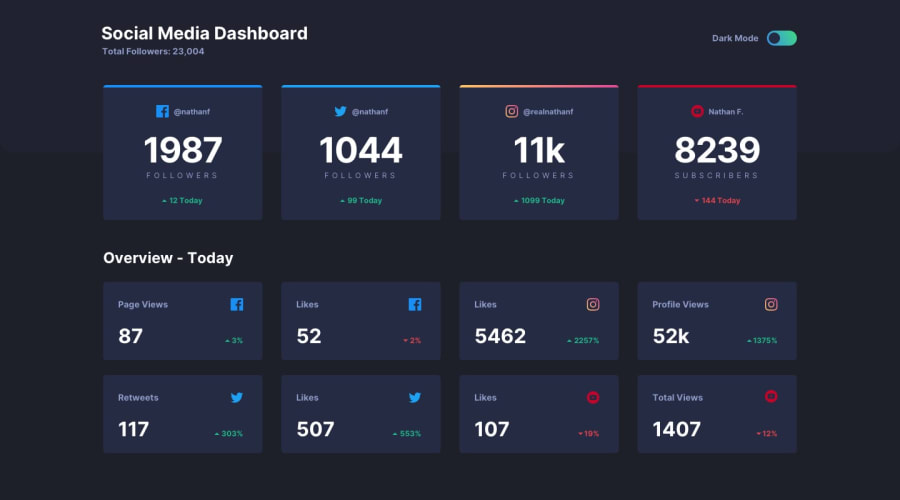
Design comparison
Solution retrospective
It's good to have something to do in my free time. Please let me know if there is anything I can improve on.
Community feedback
- @radenadriPosted over 3 years ago
Hello dngtnv, congratulations it's a great work! 👏🙌
The layouts and the elements are match the design, and the dark mode toggle works as well!
But i found one specific issue and one addition based on my opinion, especially in mobile (<= 425px) viewport :
-
The top padding on social-media container are blocking the dark mode toggle, so the toggle can't be clicked. I believe the solution for this you can add margin-top to this container on mobile breakpoint, maybe 40px is enough and you good to go!
-
Since the user id element contains image and text, i think you can use span element to wrap the elements, because span acts like a div but for inline element, and for the text you can wrap it in p tag. Because p tag mostly used for text only. 😁
Reference : https://developer.mozilla.org/en-US/docs/Web/HTML/Element/span
That's it from me, keep coding! 👏🙌
Marked as helpful1@dngtnvPosted over 3 years ago@radenadri Wow, I've made a mistake. Thank you for sharing your advice with me.
0 -
Please log in to post a comment
Log in with GitHubJoin our Discord community
Join thousands of Frontend Mentor community members taking the challenges, sharing resources, helping each other, and chatting about all things front-end!
Join our Discord
