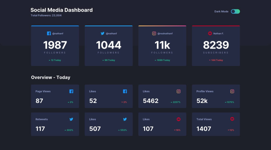
Design comparison
SolutionDesign
Solution retrospective
Any feedback will be welcome. Feedbacks help me improve myself.
Community feedback
- @nhWIZARDSPosted over 3 years ago
Few suggestions I have here
• You can use rem / em instead of using pixels.
• Use rem as the unit for most of your property value. For complex layout arrangement, use percentage (%)
• Try BEM naming conventions
• BEM (which stands for Block-Element-Modifier) is a naming convention standard for CSS class names.
Your solution looks good 🎉
Great work here 👍
Marked as helpful0@ashiqfuryPosted over 3 years ago@nhWIZARDS Thanks for your valuable suggestion. In upcoming projects, I will consider this to make a better one. Thank you so much.
1 - @ChamuMutezvaPosted over 3 years ago
Nice work Fury:
- at 375px , according to the design the content should be in one column not 2.
- for decorative images use
alt="" - issues to fix - typo
<p class="user">Nathan F./p></p>
Marked as helpful0
Please log in to post a comment
Log in with GitHubJoin our Discord community
Join thousands of Frontend Mentor community members taking the challenges, sharing resources, helping each other, and chatting about all things front-end!
Join our Discord
