Social Media Dashboard using React with TypeScript and Tailwind
Design comparison
Community feedback
- @shivaprakash-sudoPosted over 2 years ago
Hello BubbleCrown,
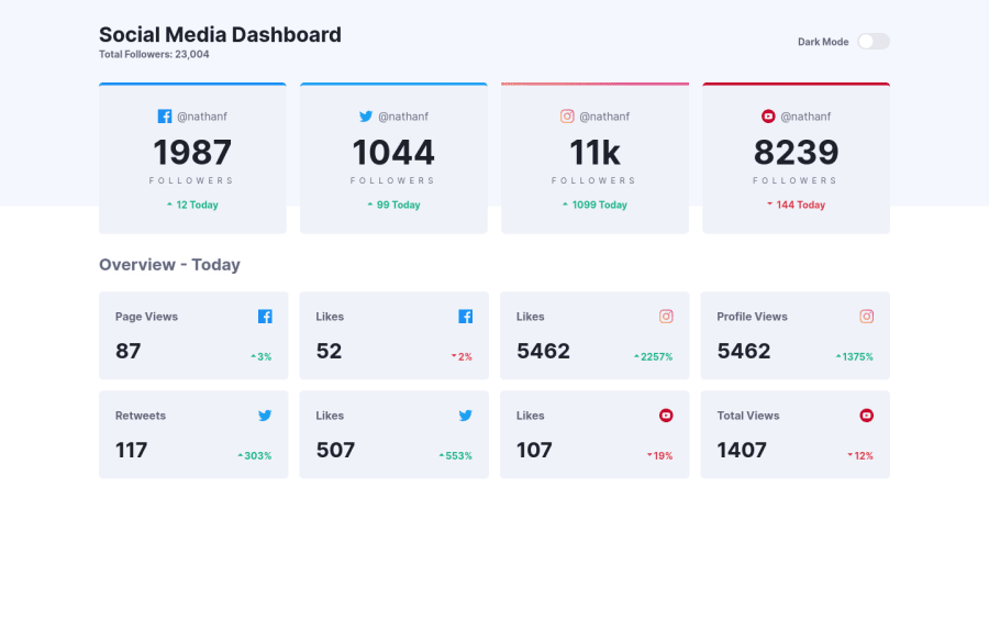
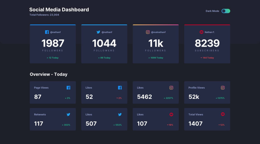
The output looks amazing, even the dark and light modes are working fantastically, good work!
Few things to consider:
- Try to change the default README from Create React App to project specific file to showcase your work and what you've learnt. A template for this can be found in the files given with the project.
- Why was
typeused as the folder name when you've created interfaces inside it?🤔 - Also, try to check your report for the site, it seems to have many issues regarding the semantic approach.
Happy coding!
1@BubblecrownPosted over 2 years ago@shivaprakash-sudo Thanks for the helpful advice! I have just finished resolving many semantic issues 😰 I have barely any free time to change the default README. but I'll find some soon!
- Interfaces folder I took a course online and saw that they named the folder like that. If it's not correct or it's not normally used. Could you please give me some advice how I should name it? 😓
0@shivaprakash-sudoPosted over 2 years ago@Bubblecrown It's okay, take your time, no need to rush it.
It's okay, I was just confused about the folder name because you created interfaces and named it "types". If I was you, I would've named the folder "interfaces" to show that it contains only interfaces and if there were any types, then I'd have created a folder named "types" telling that it contains only types. This is nothing to worry about, I was just nit-picking😁.
Keep up the good work and go beyond your goals!
0
Please log in to post a comment
Log in with GitHubJoin our Discord community
Join thousands of Frontend Mentor community members taking the challenges, sharing resources, helping each other, and chatting about all things front-end!
Join our Discord
