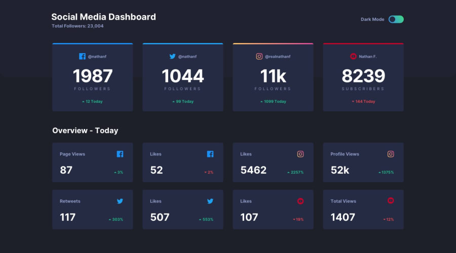
Design comparison
Solution retrospective
I'm proud of mastering Tailwind and extending its theme. Tailwind made implementing the dark theme straightforward once the colors were configured. Initially, I created the desktop design, followed by the mobile design. In the future, I'll likely start with the mobile design, as I had to constantly verify changes against the mobile layout whenever I added new elements.
What challenges did you encounter, and how did you overcome them?I encountered some issues with the toggle component. While searching online for inspiration, I found it challenging to translate traditional CSS into Tailwind CSS.
What specific areas of your project would you like help with?The layout isn't fully responsive as it only supports two sizes: mobile and desktop. The in-between range looks quite off. Any tips would be greatly appreciated.
Community feedback
- @haquanqPosted 4 months ago
Hello @Simplify4Me2 👋👋
About responsiveness, the only tips i got for you is adding more breakpoints and slowly shifting the layout (4 col - 3 col - 2-col -1 col for example), a little bit more work but worth it. I notice you are using flex to manipulate each card, use
display: gridinstead because it supports more grid layout manipulation features.About the top colorful decoration pattern, you can use pseudo element
::before / ::afterwith 'position: absolute' (card withposition: relative) to achieve thisAbout HTML markups semantic, you are abusing
divfor everything. Consider other HTML elements likesection, article, ul, li, p, small, strong,.... For example each section of card could be usingul, lito represent a list of cards (with the same context).Hope this help, happy coding 🔥🎇🎇
Marked as helpful1@Simplify4Me2Posted 3 months agoHello @haquanq,
Thank you for the valuable feedback. It's much appreciated!
I've updated my solution, making use of the things you suggested. I had never used
display: gridbefore, so I definitely learned something new here 😊. It really does give you more control over the layout positioning, even though it requires media queries to update the number of cols like you mentioned. It also helped me to position all elements on the overview card.The colorful decoration pattern is updated with the use of the
::beforepseudo element.I've used other HTML tags so I don't abuse the div element for everything, but the html report still mentions that the
articleorsectionelement lacks heading. Do you have a better suggestion perhaps?Thanks again for the feedback, happy coding 🤓🤓
0
Please log in to post a comment
Log in with GitHubJoin our Discord community
Join thousands of Frontend Mentor community members taking the challenges, sharing resources, helping each other, and chatting about all things front-end!
Join our Discord
