Submitted over 4 years ago
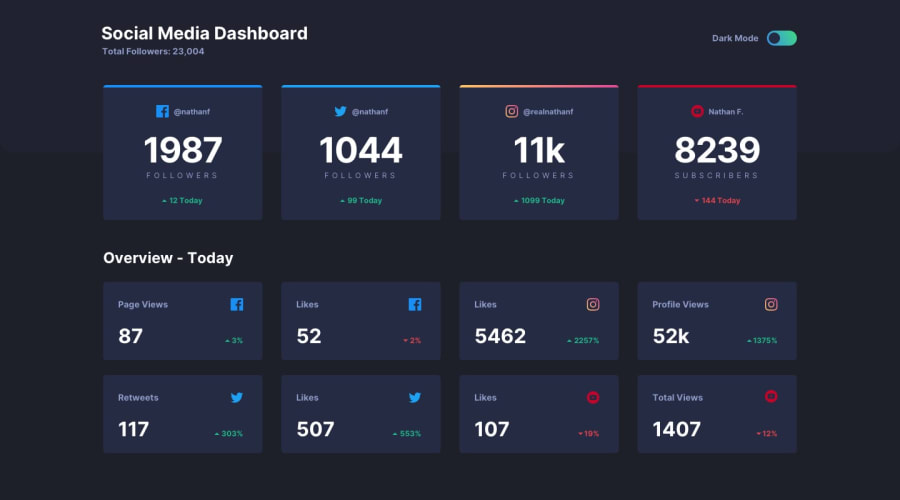
social media dashboard using javascript | HTML | CSS
@shrey1799
Design comparison
SolutionDesign
Solution retrospective
hey guys!! this was the first time I tried building something with javascript , any suggestions of how to do it better would be of great help . thank you 😊.
Community feedback
- @ovidiuantonioPosted over 4 years ago
Hello,
You did a very good job on this. The site is responsive and it looks very good. But I found some things that you can improve to make the solution even better:
- just when the page loads, the hover color on the cards is kinda too bright, but it changes when I toggle the themes
- replace the
cursor: grab;withcursor: pointer;since the switcher is not draggable - you can align the arrow and percentages with flexbox. Flexbox is a very good way of aligning elements and I use this pretty much everywhere
- instead of toggling classes you can use css variables in your css. Variables can be modified in js. That's an easier way to create a theme switcher
Happy coding! Keep going!
1
Please log in to post a comment
Log in with GitHubJoin our Discord community
Join thousands of Frontend Mentor community members taking the challenges, sharing resources, helping each other, and chatting about all things front-end!
Join our Discord
