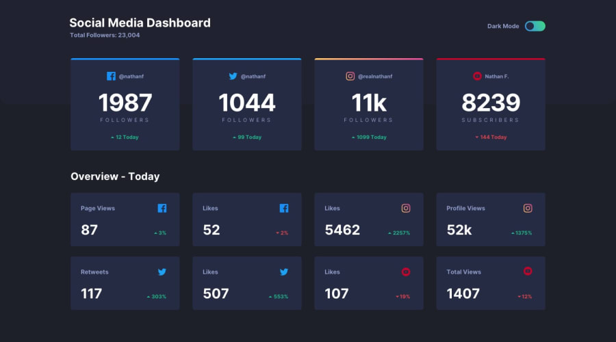
Social media dashboard using HTML SCSS & JS
Design comparison
Solution retrospective
hello, please i need yous feedback to know if it's correct!
Community feedback
- @Martinien-FokouePosted almost 4 years ago
thanks for the feedback Grace. i'll make change later and i hope you'll give another feedback to it. Thanks
0 - @grace-snowPosted almost 4 years ago
Hi Martinien, This solution looks pretty and very close to the original design but the html needs work. There are no text elements at all on the page at the moment, just spans and divs, and no accessible names on the images. The up down triangles are important to convey meaning for example, they need to tell people whether it's an increase or a decrease in followers.
The other thing I'd address is trying to make your toggle accessible. It should be an interactive element - that would give keyboard usability and make it usable to other assistive tech as well.
Hope thats all helpful
0
Please log in to post a comment
Log in with GitHubJoin our Discord community
Join thousands of Frontend Mentor community members taking the challenges, sharing resources, helping each other, and chatting about all things front-end!
Join our Discord
