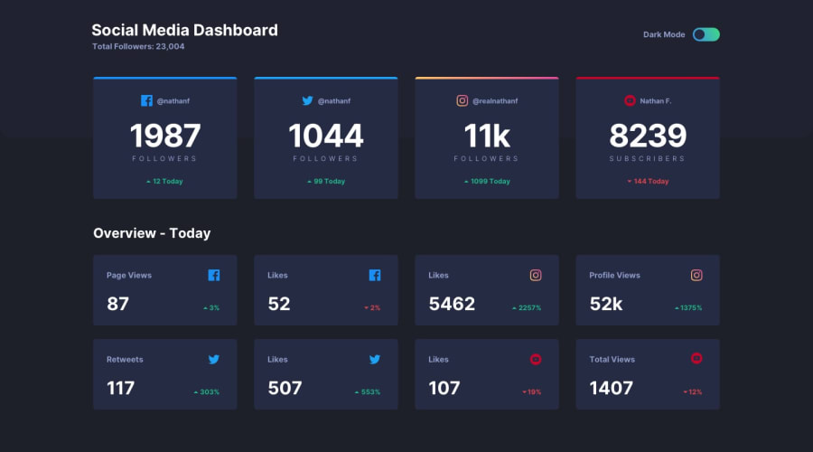
Social Media Dashboard that pulls stats from dummy data
Design comparison
Solution retrospective
Currently having an issue with the .attribution. It's where it needs to be when on Desktop, but stay at the bottom when the dashboard is in it's mobile-query. I take it the solution will require some form of restructuring.
Community feedback
- @pikapikamartPosted over 3 years ago
Hey, good work on this one. Though I had to zoom out because the layout is large. Are you using large screen? I am using a 1366x768 which lot of users as well is using, so they are getting this layout as well and your mobile layout is not properly implemented and it is massive, the cards.
Suggestions would be that:
-
I tried tweaking some css and I could not get to fix the layout. You put a lot of fixed
widthon those different container which is really hard to handle. You are using lot of flex, so why do you need to add some widths to the child of it, since you are just usingspace-between, only the container needs that to align them properly. Refactoring those will be really beneficial, making it responsive and look good, not only to the screen that we are using, but for others as well too. -
Adding some
cursor: pointerto the toggle mode. -
Making just the whole layout responsive. That will be really awesome if you could re-implement this to a responsive layout and the mobile state as well really needs to be refactored because it is massive.
But still, good work on this but keep in mind about refactoring it okay^
0 -
Please log in to post a comment
Log in with GitHubJoin our Discord community
Join thousands of Frontend Mentor community members taking the challenges, sharing resources, helping each other, and chatting about all things front-end!
Join our Discord
