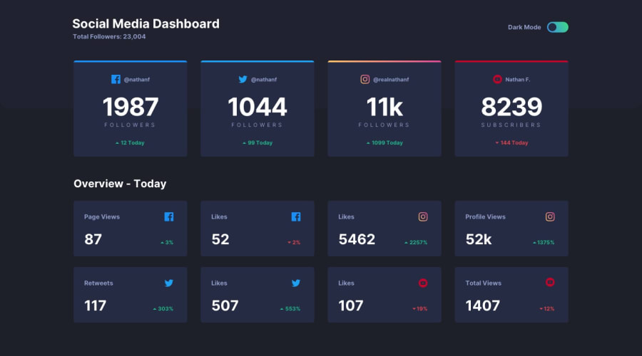
Design comparison
SolutionDesign
Solution retrospective
Constructive criticism is allowed. Happy coding
Community feedback
- @archihalderPosted over 1 year ago
The mobile view looks good. But the desktop view needs a few modifications -
- Try to align "Social Media Dashboard" heading, Dark mode toggle, "Overview Today" heading and the bottom cards like the top cards
- You can try using grid instead of flex
- Try to match the given design as much as possible. I'm not telling you to go for pixel perfection, but one thing you can do to achieve this is by opening your project and the design jpg side-by-side in vscode (or any editor) and then eyeball it. Honestly, I'm not good at this either, but this trick has helped me a lot.
- Try to implement the hover effect on the cards and the dark mode toggle. Check the active state jpg for more info.
All the best. Happy coding!
1
Please log in to post a comment
Log in with GitHubJoin our Discord community
Join thousands of Frontend Mentor community members taking the challenges, sharing resources, helping each other, and chatting about all things front-end!
Join our Discord
