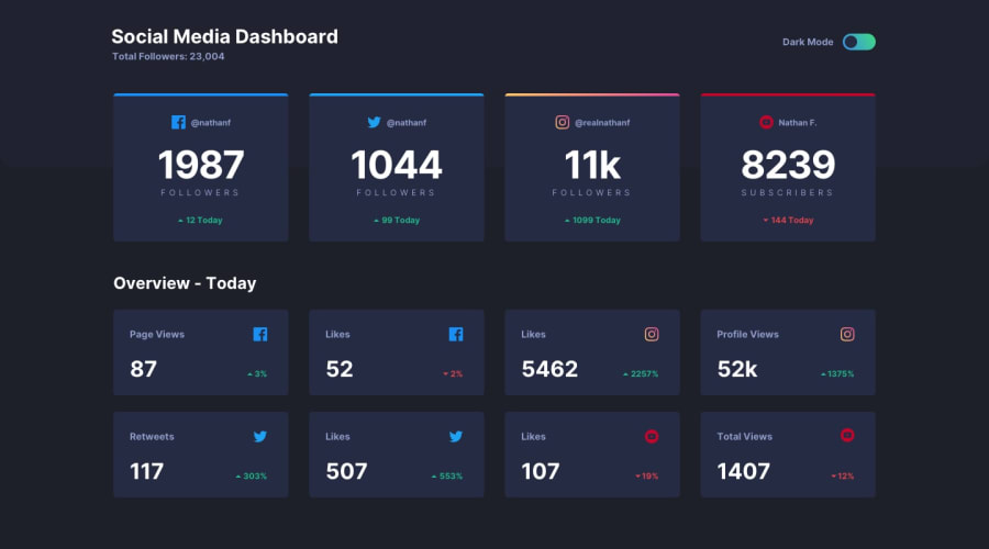
Design comparison
Solution retrospective
CSS Grid - I have limited experience working with CSS grid so completing this project allowed me to familiarized with it more and hence making me proud with my progress with CSS thus far.
What challenges did you encounter, and how did you overcome them?I'd say the media query was my biggest challenge and although I am happy it worked at the end of the day, I find my approach to be inefficient and definitely the 'last resort' For context, I used absolute positioning to position the dashboard containers for phone screen sizes. In other words, I individually position each and very dashboard container which is far from efficient or 'clean' in my opinion.
What specific areas of your project would you like help with?If anyone have any suggestions regarding a different approach to responsive screen sizes then please let me know. Any suggestion is greatly appreciated!
Community feedback
- @DaniNewAccPosted 6 months ago
Hello, i think 3 main things can be improved.
- Instead of giving fixed size to grid-template-columns use
grid-template-columns: repeat(numberOfCol, 1fr)with this type of approach every column will be spaced on all the free space the page has. Also, if you want to decrease/increase the number of col you want just modify it in the media queries for the screen size you need. - Center the content on the body of the page with
margin: 0 auto - Remove horizontal scrollbar by adding on the body of the page
overflow-x: hidden
Marked as helpful0@benhyhPosted 6 months ago@DaniNewAcc
I appreciate the feedback! I will look into it and make changes.
1 - Instead of giving fixed size to grid-template-columns use
Please log in to post a comment
Log in with GitHubJoin our Discord community
Join thousands of Frontend Mentor community members taking the challenges, sharing resources, helping each other, and chatting about all things front-end!
Join our Discord
