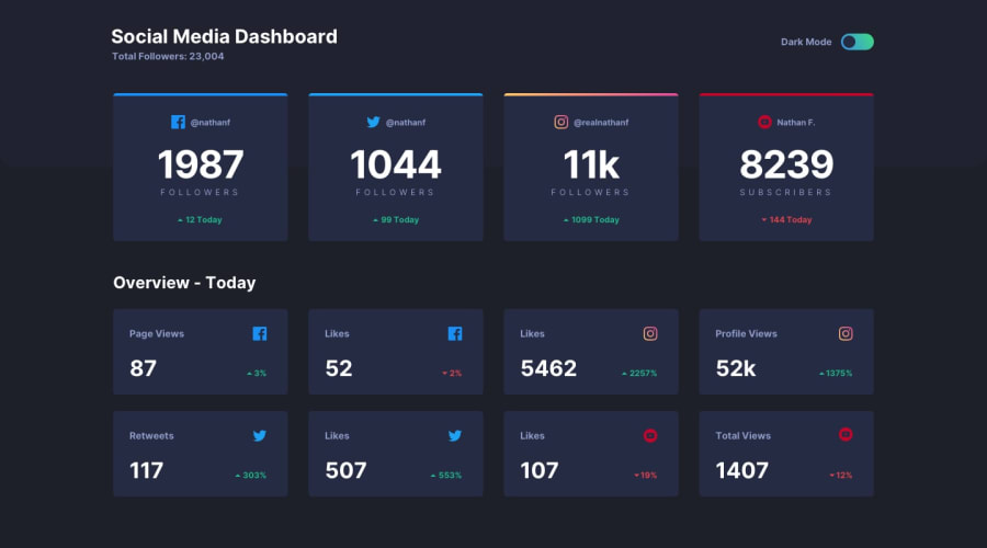
Design comparison
SolutionDesign
Community feedback
- @Kamasah-DicksonPosted over 2 years ago
- Your Solution looks great and respective on smaller devices.
- Try to focus on the HTML issues reported. To help you with it, there should always be an h1 as your first heading tag .
NB: Don't mix your h tags. They should decrease by one level at a time.
Besides have a nice weekend and a happy coding👍💻
0
Please log in to post a comment
Log in with GitHubJoin our Discord community
Join thousands of Frontend Mentor community members taking the challenges, sharing resources, helping each other, and chatting about all things front-end!
Join our Discord
