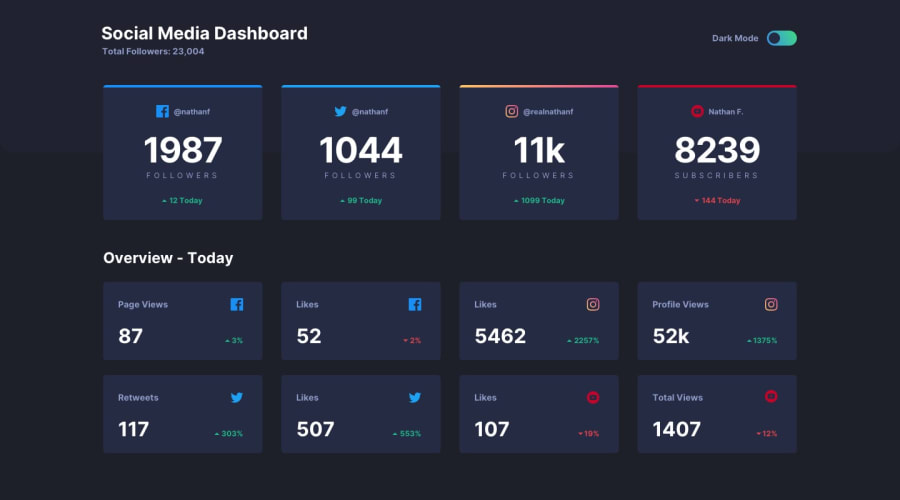
Design comparison
SolutionDesign
Solution retrospective
I used firefox browser to open it and the view was different from chrome. I am having a little tough time trying to make it responsive. Any feedback on how to solve these issues are welcome and will be much appreciated. Thank you.
Please log in to post a comment
Log in with GitHubCommunity feedback
No feedback yet. Be the first to give feedback on James Kofi Myers's solution.
Join our Discord community
Join thousands of Frontend Mentor community members taking the challenges, sharing resources, helping each other, and chatting about all things front-end!
Join our Discord
