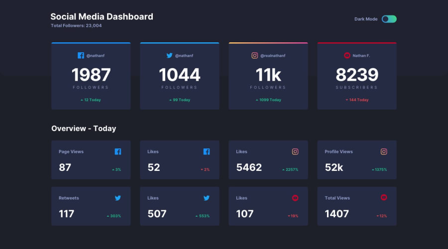
Social media dashboard - responsive e dynamic theme
Design comparison
Solution retrospective
Hello devs, I would like an analysis about this challenge and about the source code that was developed for this project. I accept constructive criticism and tips on how to improve it, thanks for the advance.
Community feedback
- @Da-vi-dePosted about 3 years ago
Hi, congrats, it's a really nice result for this challenge. Good use of semantic HTML. It's nearly perfect, i noticed the instagram card misses that peculiar angle. You need a pseudo element and positioning, i did it this way:
.instagram {
    position: relative;
}

.instagram::before {
    position: absolute;
    content: '';
    width: 100%;
    height: 4px;
    top: -1px;
    left: 0;
    background: var(--instagram-color;)
    border-top-left-radius: 5px;
    border-top-right-radius: 5px;
}
The cursor doesn't need to be pointer, it would be great if there was the hover effect on cards.
Good job, keep coding :-)
Marked as helpful0 - @dkhenriquePosted about 3 years ago
hello davide, thanks for the words and for the help. I made the correction to the instagram card and plan to add the focus effect you told me about. thank you again
0
Please log in to post a comment
Log in with GitHubJoin our Discord community
Join thousands of Frontend Mentor community members taking the challenges, sharing resources, helping each other, and chatting about all things front-end!
Join our Discord
