Social Media Dashboard - React, Dark/Light Mode Themes, CSS Flex/Grid
Design comparison
Solution retrospective
Hello FEM community! 😄
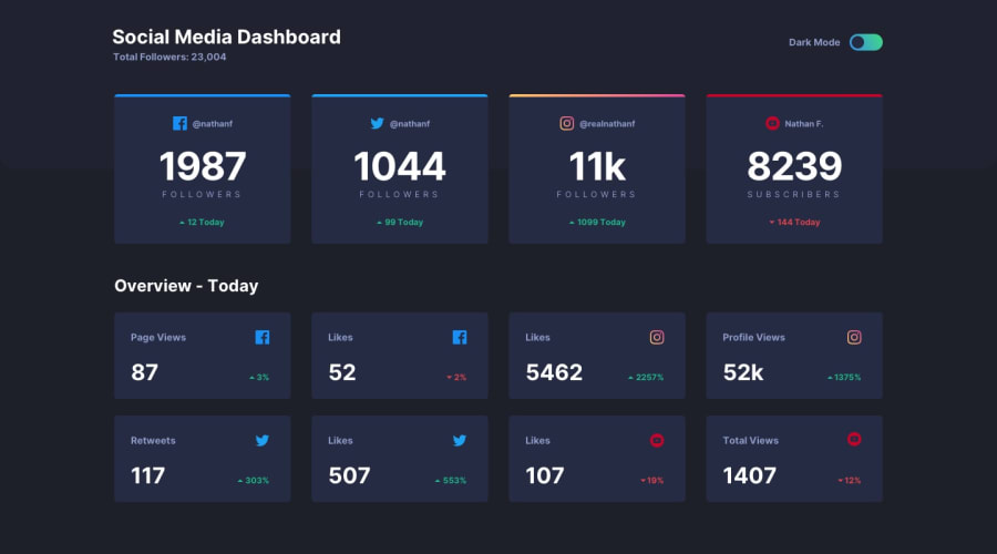
This is my solution to the Social Media Dashboard challenge. This was one of my favorite challenges so far! React helped a lot when it came to breaking up the design into discrete components and reusing them to build out the full website. And making the layout responsive was easy peasy with the help of CSS Grid and grid area templates!
The hardest part by far was implementing the dark/light mode themes - usually, with React, you'd set up a Context provider for the theme and consume the Context's value with the useContext() hook but I didn't know how to use Context back I was building this, so I just resorted to using good ol' state, conditionally assigning theme classes to components with ternaries and string templates, and building seperate stylesheets for each theme. It's tedious, I know, but it works, and I've learned my lesson from now on 😂
Any feedback would be greatly appreaciated! 😉
Community feedback
Please log in to post a comment
Log in with GitHubJoin our Discord community
Join thousands of Frontend Mentor community members taking the challenges, sharing resources, helping each other, and chatting about all things front-end!
Join our Discord
