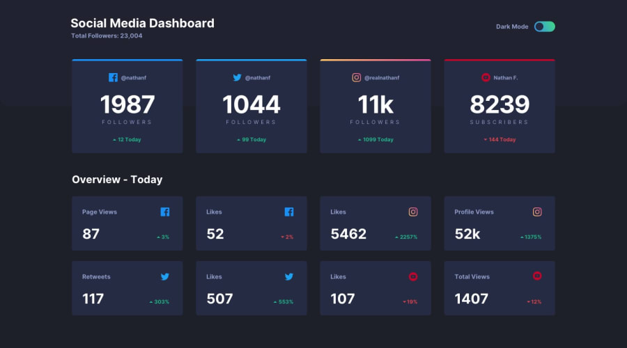
Social media dashboard - React & Styled-components
Design comparison
Solution retrospective
What was your solution for creating the instagram gradient top border? I had a hard time adding rounded corner to it. What's your opinion on using grid for this layout?
Community feedback
- @DiarrahPosted over 4 years ago
Hey, Lin,
Very, very nice work! You did such a good job with the React + styled-components. I've been trying to learn how to use variables within the styled-components & your code just helped me so much to understand, so I thank you!
As for your questions: you should definitely use a grid outline for this design. The way I think I did the IG color was to use an ::after selector & then a linear-gradient with a bg color + then the card overflow: hidden.
1@DiarrahPosted over 4 years ago@Diarrah Wait! One question I have for you if you're willing to answer. Can you explain these calculations just so I know what you're doing?
padding: 40px calc((162 / 1440) * 100%) 0; width: calc( (1 - (162 / 1440)*2) * 100%);
What do these mean?
0
Please log in to post a comment
Log in with GitHubJoin our Discord community
Join thousands of Frontend Mentor community members taking the challenges, sharing resources, helping each other, and chatting about all things front-end!
Join our Discord
