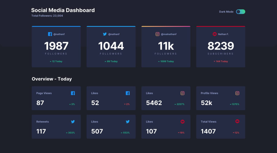
Design comparison
Solution retrospective
This was a really fun project to work on! I did have some troubles with the responsive design though, especially the divider that appears on smaller screens to separate the title and the theme toggle.
There is one particular area that I would like to seek some advice on. My <main> section is positioned absolutely on top of the .app-top-bg element. Because of this, the parent element (containing both my .app-top-bg and <main> elements) "wraps" around the app-top-bg element only, since it is part of the normal document flow but not the <main> element.
Coincidentally, this looks fine in light theme because the background color of the app is white in light theme, which is the default for the html body. But when in dark theme or if the background color of the light theme was to be different, the background color of the application will remain the html body default (i.e. white). This is not because the background color isn't applied, but because the background element with the background color applied has height equal to the .app-top-bg element.
The workaround I found for this was to use document.querySelector to select the parent element using its classname, and get its scrollHeight so as to set the height of the parent element. This works, but I'm not really satisfied with it, since to a certain extent, I would consider it to be hardcoding. As such, I'm wondering if there is a better way to approach this.
Also, I would like to ask for feedback in the following areas (but not limited to):
- structure of the react components
- structure of the CSS files
- the semantics of the html tags used
Any comments on how they could have been done differently (and better) or in any other areas are also welcome!
Community feedback
Please log in to post a comment
Log in with GitHubJoin our Discord community
Join thousands of Frontend Mentor community members taking the challenges, sharing resources, helping each other, and chatting about all things front-end!
Join our Discord
