Submitted over 4 years ago
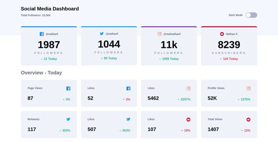
Social media dashboard | Mobile First using Sass
@SimonettiT
Design comparison
SolutionDesign
Solution retrospective
This is the first time I make a web page using the Mobile First method and I'm really proud of the final design and the progress I've had improving my level in HTML, CSS, and a little bit in JS.
Community feedback
- @Mahesh-yadavPosted over 4 years ago
Hi
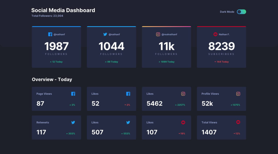
Good work. The border on the instagram card does not match the design. One the solutions is to use
backgroundproperty.background: var(--gradient-instagram); background-size: 100% .4rem; background-repeat: no-repeat;1@SimonettiTPosted over 4 years ago@Mahesh-yadav Thanks for the advice! When I was doing it at the beginning I didn't know the solution to make the gradient border of a div but thanks to your advice I have achieved it! The problem is now fixed.
0
Please log in to post a comment
Log in with GitHubJoin our Discord community
Join thousands of Frontend Mentor community members taking the challenges, sharing resources, helping each other, and chatting about all things front-end!
Join our Discord
