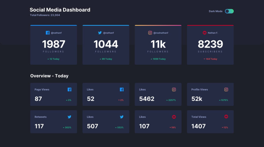
Design comparison
SolutionDesign
Solution retrospective
This one was a bit of work. This is my sixth or seventh project and I now JUST realized AFTER finishing that there is a style guide that gives you the colors and fonts used in the project.
I feel like some of the CSS and javascript might be a little sloppy or more complicated than it needs to be, but I got the job done.
I might need to spend a little more time thinking about the big picture from the start, because I had to go through the html and manually add a lot of classes to help with toggling dark mode.
Community feedback
Please log in to post a comment
Log in with GitHubJoin our Discord community
Join thousands of Frontend Mentor community members taking the challenges, sharing resources, helping each other, and chatting about all things front-end!
Join our Discord
