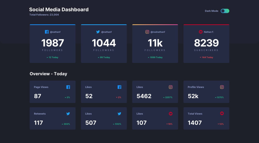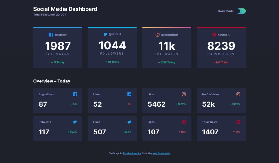
Design comparison
Solution retrospective
I am actually pretty pleased with how this challenge turned out.
Feedback is of course always welcome, however, and I look forward to seeing how others solved some of the issues.
Community feedback
- @mattstuddertPosted over 4 years ago
Awesome work on this challenge, Leshy! Your solution looks amazing and scales down really well to mobile 😍
The only tiny suggestion I'd have would be to give screen reader users an indication of whether or not the increase/decrease numbers are in fact positive or negative. At the moment, you're using a class to set a
background-image
. This is absolutely fine but I'd also add anaria-label
to thespan
elements. For example, this:<span class='val-change val-change--down'>12%</span>
Would become this:
<span class='val-change val-change--down' aria-label='Down 12%'>12%</span>
This would mean the screen reader software would read out "Down 12%" therefore providing more context.
I hope this helps! Keep up the awesome work. It's also been great to see you giving feedback on other people's solutions. You're giving some amazing advice! 🙌
1@LeshyNLPosted over 4 years agoHi @mattstuddert! Thanks a lot for your comment, and above all, also thanks for putting Frontend Mentor together. It is a really cool initiative, and mad props to you.
That is also a really good suggestion on the ARIA label – much appreciated. I have to admit that they are a bit of a blind spot for me (no pun intended).
Most of the resources on ARIA that I have been able to find tend to go into which properties are available (quite a lot), but they tend to discuss less which ones to commonly use and when; I would not have thought of using an
aria-label
in this particular way, for example. Are there any good resources on them that you could recommend off-hand?0@mattstuddertPosted over 4 years ago@LeshyNL I'm glad you like it! It's great to see the community grow and see people helping each other out.
That's a good question. No resources specifically come to mind that discusses
aria-*
uses particularly well. But here are a couple of great accessibility resources that I often refer to:Smashing Magazine often focus their articles on accessibility as well. So it's worth subscribing to their newsletter and keeping up with their latest articles.
I hope that helps!
1@LeshyNLPosted over 4 years agoThanks, @mattstuddert, will definitely check those out!
And I do already read Smashing Magazine regularly, but not a bad idea to subscribe to the newsletter as well.
1
Please log in to post a comment
Log in with GitHubJoin our Discord community
Join thousands of Frontend Mentor community members taking the challenges, sharing resources, helping each other, and chatting about all things front-end!
Join our Discord