Social media dashboard: HTML, SCSS, JS
Design comparison
Solution retrospective
Corrections are welcomed.
Community feedback
- @grace-snowPosted almost 4 years ago
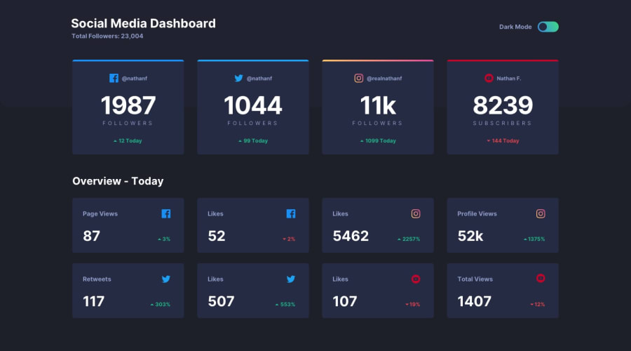
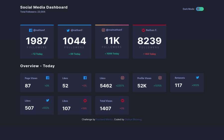
Hey looks great on mobile, well done! Looks like there's something wrong with the grid on desktop from that preview though.
To make your toggle accessible you're very close but not quite there. Either the words 'dark mode' need to be within the label element (recommended), or they need an ID adding and an
aria-labelledby="THAT-ID"
adding to the checkbox input.Hope that helps ☺
1@Olaleye-BlessingPosted almost 4 years ago@grace-snow Thanks for your advice. I've made the correction, 'dark mode' is now within the label element. I never thought of accessibility(I only heard a little about it when I started web dev) when I started the project. I could have tried the second method but to be honest, this is my first time of seeing aria-labelledby :). I guess aria-labelledby relates to accessibility. Thanks for your comment and you can check it out now in case I could improve on other things. Thanks
1
Please log in to post a comment
Log in with GitHubJoin our Discord community
Join thousands of Frontend Mentor community members taking the challenges, sharing resources, helping each other, and chatting about all things front-end!
Join our Discord