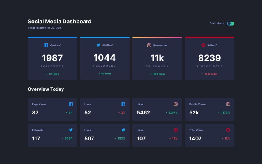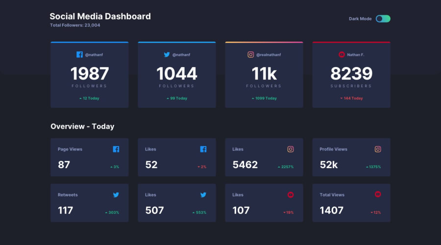
Social Media Dashboard by Watership 🌊| Desktop First
Design comparison
Solution retrospective
Hey, I am Watership💧🙋♂️. And this is my solution for the social media dashboard challenge. 🚀
Goals Accomplished ✅:
- I was able to get better with VueJS and TailwindCSS🛩️
- I got better with Components 👌
Built With🪄:VueJS✔️TAILWINDCSS✔️
Overall, I really liked this challenge, and would appreciate any feedback that's given. ❤️
Watership💧🌊✌️🙋♂️
Make a marvel api prject
Community feedback
- @kanishkasubashPosted over 1 year ago
Hey, Watership👋. Congratulations on successfully completing the challenge! 🎉
Your solution looks great, and you've done a fantastic job overall! However, here are some small suggestions after taking a look at your code to make it even better:
- It doesn't fit on a range of mobile screen sizes.
- Window: localStorage property Link. This helps you to manage the dark/light state against the page reloading as well.
I hope you find this helpful! 😄 Keep up the great work! 👍
🖥️Happy coding!
Marked as helpful1@Watership6Posted over 1 year agoHi @kanishkasubash 🧑💻, Thank you for your insights. I didn't know that there was such a useful property, and will ensure to read up on it for my next project. 😁As for the mobile responsiveness, I am still quite a newbie in frontend development, and am quite new to making my webpages responsive, however I will make sure I learn more about it and try to implement it into my next solution. ✅
Thank you for your amazing feedback, Watership🌊
0@kanishkasubashPosted over 1 year agoHi, Watership
Here are some small tips for the mobile responsiveness for your future projects to make it even better:
The "mobile-first approach" is a design and development strategy used in web and application design. It involves creating a website or application's layout and functionality primarily for mobile devices before addressing larger screens, such as tablets or desktops. This approach stems from the increasing prevalence of mobile devices and the need to ensure a seamless user experience across a wide range of screen sizes and devices.
Key principles of the mobile-first approach include:
-
Starting with Mobile: Instead of designing for desktop computers first and then adapting for smaller screens, designers and developers begin by focusing on the mobile experience. This forces them to prioritize essential content and features due to the limited screen real estate.
-
Content Prioritization: With limited space available on mobile screens, designers must carefully choose which content, features, and functionalities are most important for the user. This process encourages a more streamlined and user-focused design.
-
Performance Optimization: Mobile devices often have slower internet connections and less processing power than desktop computers. By designing for mobile first, developers are prompted to optimize performance, leading to faster load times and smoother interactions for all users.
-
Responsive Design: The mobile-first approach encourages the use of responsive design techniques. This means that as the screen size increases, the layout and design adapt to provide the best possible user experience on each device. This fluidity results in a consistent and visually appealing design across various devices.
-
Progressive Enhancement: This approach also involves adding more complex features and enhancements as the screen size grows. This ensures that users on larger screens benefit from additional features without sacrificing the core functionality that was designed for mobile users.
-
Simplicity and Clarity: Mobile-first design often emphasizes simplicity and clarity. With limited space, designers must be concise and deliberate in their choices, which can lead to cleaner and more straightforward user interfaces.
-
User-Centered Approach: By prioritizing mobile users, the mobile-first approach inherently focuses on the needs and preferences of a significant portion of the audience, as mobile device usage continues to grow worldwide.
Adopting a mobile-first approach can result in several benefits, such as improved user satisfaction, higher mobile search rankings (as search engines increasingly prioritize mobile-friendly websites), better performance, and a more adaptable and future-proof design.
It's important to note that the mobile-first approach doesn't mean that desktop users are neglected. Instead, it acknowledges that mobile devices have become the primary means of accessing the internet for many users and encourages designers and developers to create a solid foundation for user experiences across all devices.
I hope you find this helpful! 😄 Keep up the great work! 👍
🖥️Happy coding!
0
Please log in to post a comment
Log in with GitHubJoin our Discord community
Join thousands of Frontend Mentor community members taking the challenges, sharing resources, helping each other, and chatting about all things front-end!
Join our Discord
