Submitted over 3 years ago
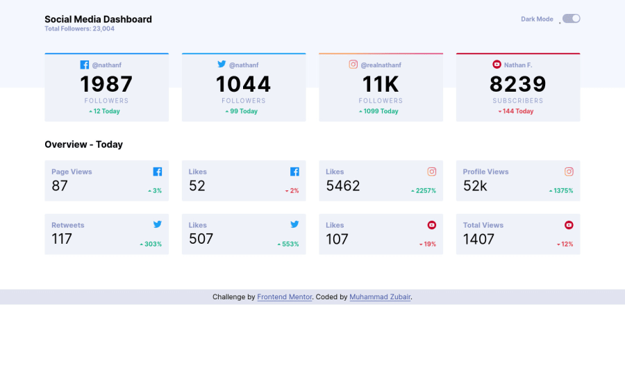
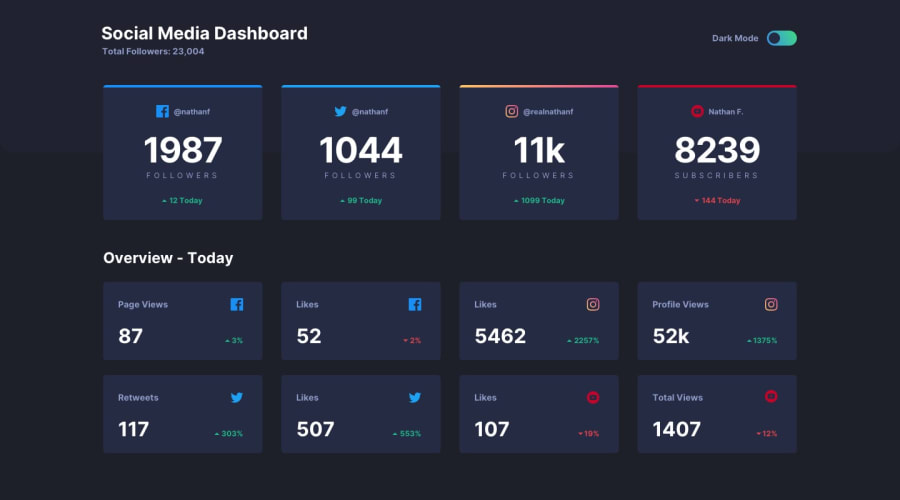
Social Media Dashboard built with HTML, CSS and Sass, and JS
@iAmZubair00
Design comparison
SolutionDesign
Solution retrospective
Hey folks,
Please go through my solution and give suggestions around:
- any bug in the live site
- accessibility issues in HTML
- issues in the approach of writing Sass
- and any other constructive feedback.
Thanks.
Community feedback
- @SeyBooPosted over 3 years ago
Hello great solution i love the animation that you provide it's simple but add a lot to the website.
I suggest you some point that you can improve :
Some visual improvement :
- Maybe add a
max-widthon the main element because on larger screen we see 2 row , one with 5 box and one with 3 box. - Add a
height: 100vh;on the container element so that i can take the full height of the screen.
JavaScript improvement:
- A easier way to do the toggle is just to add the class 'light' in the body element.
For the SCSS part your code is very well cut and organised and seem well typed so well done.
A overall great solution keep going !
1 - Maybe add a
Please log in to post a comment
Log in with GitHubJoin our Discord community
Join thousands of Frontend Mentor community members taking the challenges, sharing resources, helping each other, and chatting about all things front-end!
Join our Discord
