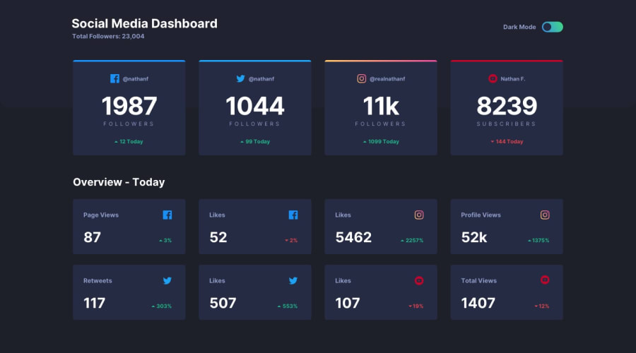
Social Media Dashboard - Accessibility, CUBE CSS, Grid, Flexbox
Design comparison
Solution retrospective
This project provided more of a challenge with learning javascript and also CSS grid. I found some of the styling particularly difficult as there are a lot of changes to colours between the light and dark mode - I need to improve my token-naming conventions to make code cleaner and more understandable. While functional; the theme toggle defaults to light - in the future I'd like to implement it so that it defaults to system default or a setting saved to local storage if the site has been visited before.
I attempted to implement accessibility with visually hidden titles and a focus state to the toggle switch, however; I think a better approach may be to hide the majority of the page and provide all the information as a table for screen-readers only.
Community feedback
Please log in to post a comment
Log in with GitHubJoin our Discord community
Join thousands of Frontend Mentor community members taking the challenges, sharing resources, helping each other, and chatting about all things front-end!
Join our Discord
