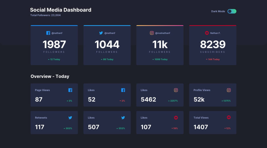
Design comparison
SolutionDesign
Solution retrospective
Any tip/advice/feedback is really appreciated
Community feedback
- @ApplePieGiraffePosted almost 4 years ago
Hello there, Carlos Estrada! 👋
Congratulations on completing your first Frontend Mentor challenge! 🎉 Good job on this one! 👏
I suggest,
- Adding a max-width to the main container or wrapper to prevent the content of the page from becoming too stretched on extra-large screens.
- Adding a max-width to the information cards to prevent them from becoming too stretched when the layout first changes from desktop to mobile.
- Adding a label to the button (or identify it in some other way) to make your solution more accessible and clear up that error on your solution report. 😉
Keep coding (and happy coding, too)! 😁
1@CareslePosted almost 4 years ago@ApplePieGiraffe Thank you for take your time and give me some feedback 😁
1 - @shadib0797Posted almost 4 years ago
Good work, just use width : 70% on main container and then adjust it for diff view port
1@CareslePosted almost 4 years ago@shadib0797 thank you for the feedback, i will make that change
0
Please log in to post a comment
Log in with GitHubJoin our Discord community
Join thousands of Frontend Mentor community members taking the challenges, sharing resources, helping each other, and chatting about all things front-end!
Join our Discord
