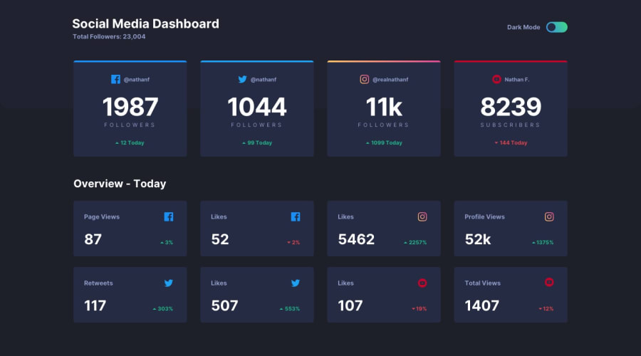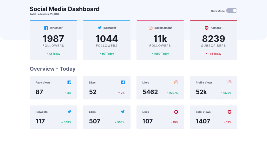
Design comparison
SolutionDesign
Solution retrospective
Hi, everybody! I decided to update this challenge for final touches and bug fixes. I would be grateful if you could give some feedback or show me where I made mistakes.
Community feedback
- @OGShawnLeePosted over 2 years ago
Hey Shawn here. Your solution looks great. Good job!
Here is some feedback:
- For the border background you can use a pseudo-element and do something like this:
/you-card-selector/ { position: relative; } /your-card-selector/::before { content: ''; position: absolute; top: 0; left: 0; right: 0; height: 0.25rem; background-color: /your colour here/; border-top-radius: 0.125ex; }
- For the theme toggler I would have used a button instead of an input.
- Your headings levels should be in order. In your HTML, make sure the next heading is one level below the previous one: LIke h1 -> h2 -> h3. Your markup has an h1 at the top and then an h3 in your first four cards . Placing an h2 in the top card section container should fix the accessibility issue from the report.
Hope this helps mate. Have a great one!
Marked as helpful1@dostonnabotovPosted over 2 years ago@OGShawnLee Thank you, Shawn. I appreciate it. Why I didn't think of pseudo elements?🤦🏻♂️ Definitely fix all those issues
0
Please log in to post a comment
Log in with GitHubJoin our Discord community
Join thousands of Frontend Mentor community members taking the challenges, sharing resources, helping each other, and chatting about all things front-end!
Join our Discord