Design comparison
SolutionDesign
Community feedback
- @Kamasah-DicksonPosted over 2 years ago
I really liked your solution it was responsive on smaller devices also. Maybe you should have added a transition to the themes but besides good👍
Happy coding📌
Marked as helpful0 - @CallMe-ALPosted over 2 years ago
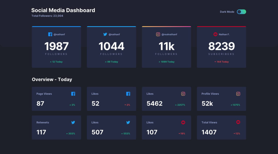
Looks nice dude! I noticed you have a black bar above the Instagram card in the dashboard. If you want to try getting the linear-gradient border, you can use pseudo-element on the card with a position absolute that sits on the top of the card. Add the gradient as the background background, some height, and a border-radius and presto!
Keep up the good work!
0
Please log in to post a comment
Log in with GitHubJoin our Discord community
Join thousands of Frontend Mentor community members taking the challenges, sharing resources, helping each other, and chatting about all things front-end!
Join our Discord
