Design comparison
SolutionDesign
Solution retrospective
Please let me know what you think and what I can do to improve! This one took me quite a while because it was over the Christmas break while my family was in town and I have been in the process of moving. This was a fun exercise though!
Community feedback
- @SzymonRojekPosted almost 4 years ago
Hi Stephen,
Really good job! I really like your solution. A few tips below:
HTML:
- you don't have to style the footer in the HTML, transfer styles to the CSS file;
- it is very good that you have used a few semantic tags in your code because semantic tags matter. Anyway, divs are semantically inert elements — elements that don’t really do or say anything. The term "semantic" refers to the meaning of a word or a thing, so "semantic elements" are elements designed to mark up the structure of a document in a more meaningful way, a way that makes it clear what they're for, what purpose they serve in the document.
- accessibility: there is no any important attributes for icons, toggle like aria, role etc. This is a huge topic but very valuable. I can recommend this article from the Smashing Magazine - Building inclusive toggle buttons. Check it out, it is a great article.
Design:
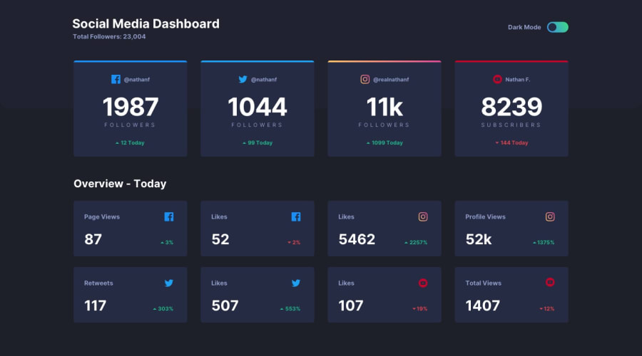
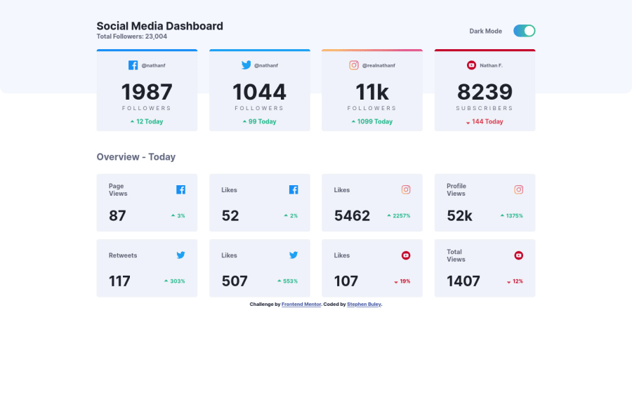
- the line after "total followers" could have more opacity so it will be more "smooth", at the moment it looks like a LINE that strongly divides the space between headings and sections below;
- the first four boxes may have larger gaps between the descriptions;
- check your main heading h1, on mobile size it is too big. You can make it more responsive on different devices;
- you did not consider other devices in your breakpoints: there is a big gap between mobile and desktop. What do you think about it?
- you can add transition when you are changing the color of the card and also when switching the mode. At the moment colors are changing rapidly. The key is a smooth transition, which is always nice but it doesn't have to be very long;
That's it from me. Ps. don't forget to upvote any comments on here that you find helpful.
Many greetings :D
1
Please log in to post a comment
Log in with GitHubJoin our Discord community
Join thousands of Frontend Mentor community members taking the challenges, sharing resources, helping each other, and chatting about all things front-end!
Join our Discord