Design comparison
SolutionDesign
Solution retrospective
What are you most proud of, and what would you do differently next time?
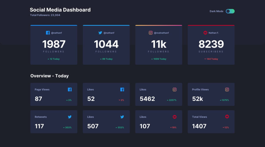
Hi here is my solution for Social-media-dashboard. I used HTML, CSS, JS.
What challenges did you encounter, and how did you overcome them?It was to create a dark theme for the first time switching between background-color and color.
Array.from(figure).forEach( (item) => item.style.color = '#fff' );
And create a border with a gradient, I finally used linear-gradient with a background.
Feel free to leave any comments. I need some advices to improve my JS and readibility.
Thanks.
Community feedback
Please log in to post a comment
Log in with GitHubJoin our Discord community
Join thousands of Frontend Mentor community members taking the challenges, sharing resources, helping each other, and chatting about all things front-end!
Join our Discord
