Design comparison
Community feedback
- @kbrandon19Posted almost 3 years ago
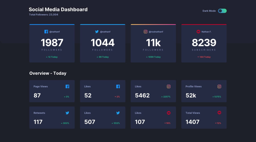
@Dunissimo, other than a few small issues like the toggle ball and background color, and the font size for the bottom cards, everything looks good. Is this your first time using flex? There is one small detail that stood out to me, the twitter card seems to be a little shorter than the rest, not sure why though.
Marked as helpful0@DunissimoPosted almost 3 years ago@kbrandon19, yes, the twitter card is actually shorter than the others. I couldn't fix it. I use Flex often, but I have little experience and if I did something wrong, no one corrected me because there was no one :)
Thanks for your feedback! (I translated with the help of a translator, so sorry for the mistakes)
0@kbrandon19Posted almost 3 years ago@Dunissimo No worries! So I played around with your code and I think I discovered the issue. I noticed you never set a fixed height for the cards - I assume to ensure it's mobile responsive - but I think that could be an issue.
I don't know why but changing height to auto for
html .social-media__overview-bigandhtml social.media__item-bigworked.As far as your class naming, why did you name and arrange them like that? I've never seen that before.
Marked as helpful0@DunissimoPosted almost 3 years ago@kbrandon19,
"As for class naming, why did you name and arrange them that way? I have never seen this before. "
I'm trying to follow BEM, but I don't know much about this methodology yet, so I didn't give the classes very appropriate names.
Sorry for not answering for a long time, I'm in 9th grade and took exams :)
0@DunissimoPosted almost 3 years ago@kbrandon19, about the height of the twitter card. The twitter icon was only 3 pixels smaller than the others.
0
Please log in to post a comment
Log in with GitHubJoin our Discord community
Join thousands of Frontend Mentor community members taking the challenges, sharing resources, helping each other, and chatting about all things front-end!
Join our Discord
