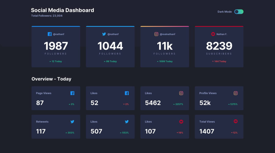
Design comparison
SolutionDesign
Solution retrospective
Any feedback is great
Community feedback
- @ApplePieGiraffePosted over 3 years ago
Hey there, Aw! 👋
Good effort on this challenge! 👍
I suggest,
- Taking a look at your solution report and trying to clear up some of the errors that are there in order to improve the accessibility of your solution.
- Adding a tablet layout to the page so that the cards aren't too wide when the layout first changes from desktop to mobile (there's still a good amount of room for a three or two-column layout).
Keep coding (and happy coding, too)! 😁
0
Please log in to post a comment
Log in with GitHubJoin our Discord community
Join thousands of Frontend Mentor community members taking the challenges, sharing resources, helping each other, and chatting about all things front-end!
Join our Discord
