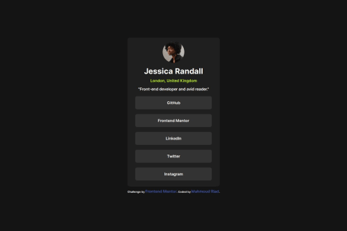
Design comparison
Solution retrospective
awesome button click effect could use variable coloring with CSS
What specific areas of your project would you like help with?i dont understand errors and how to fix it pleas hint me
Community feedback
- @TedJenklerPosted 2 months ago
Hi Mahmoud,
Nice project! Here are a couple of suggestions:
Try to avoid using too many <div> elements. Replace them with semantic HTML elements whenever possible. If you can't find a suitable replacement, consider using aria-label to describe the content for screen readers. This will enhance both accessibility and search engine optimization.
Given the shareability of these links, consider adding OG meta tags to create visually appealing, shareable links and further optimize SEO.
Hope this helps!
Best, Teodor
Marked as helpful1 - @geomydasPosted 2 months ago
Just read your code, a lot of issues here and there but they can be easily fixed
For the HTML, I would suggest the following
-
Use headings such as
<h1>
. Don't use paragraphs for everything. Content hierarchy matters aswell and semantic HTML. Its pretty easy to decide when to use a heading since they are short and have a large font-size most of the time. -
Don't use divs and spans that much. There are too much divs and spans in your HTML and you could've just apply the styles directly to some of the elements. Also, use spans inside text and divs for containers. An example on where you will use span is having a word inside a block of text with a different color.
-
Differentiate links from buttons. A link sends you to another website or page, a button triggers an action such as toggling a menu. Even if it looks like a button, it is not always a button. You should change all of the buttons in your code into a link.
The CSS is full of issues but you can easily fix them, I reccomend you do the following
-
Use a CSS reset. What a CSS reset does that it makes your CSS look the same in most devices and it makes your life easier aswell because you don't have to wrestle with defaults. You just copy and paste them and voila! Most people use Andy Bell's or Josh Comeau's CSS reset
-
Use color names when naming variables with colors. Don't use
--danger
, use--red
instead. -
Learn BEM methodology for naming your classes. It makes it easier to write classes, it makes it easier to understand because it conveys it meaning more clearly.
-
Use rem unit in place of px. Most of the time, rem is what you only need. You would only use px for smaller things such as borders, outlines, shadows and blurs. Using rem respects the user's set font size aswell making it more accesible to everyone.
-
Use the actual font names themselves. Don't customize it like using
largen
andsimply
. Use Inter or whatever the real name of the font is. It's less maintanable and harder to understand. -
Use font fallbacks. Like
font-family: Inter, sans-serif
. It makes it so that the font still looks good even if the original doesn't load properly. Most of the time, you will use sans-serif as a fallback font -
Use actual units for the font-sizes. I don't reccomend using
medium
,large
,normal
and etc. for setting them. Use rem instead. It makes it easier to read since they have an exact unit and you dont have to guess the sizes.
Lastly, use a code formatter such as Prettier so you code is easier to read and you don't have to manually add indentations.
Marked as helpful1@Mahmoud-Riad00Posted 2 months ago@geomydas pro you are my legend ,
These tips is epic I'll try follow them Thanks a lot for your attention to my code I hope you became a billionaire π
0 -
- @abdoul-EHPosted 2 months ago
no, the solution does not differ from the design
1
Please log in to post a comment
Log in with GitHubJoin our Discord community
Join thousands of Frontend Mentor community members taking the challenges, sharing resources, helping each other, and chatting about all things front-end!
Join our Discord